Calligraphic Woodcuts: The visual relationship between image and text in Die Schriftgiesserei im Schattenbild [Book Set 2]

Going back to a previous book set (in order to catch up with my blog posts!), I find it fascinating now to examine the visual relationship between image and text since there are multiple ways of relating the two.
As a class we have really been exploring the relationship between these two components in terms of the tension they have on the page or within the layout on the page. There is a certain power struggle that emerges between image and text and from this struggle one could certainly overpower the other in terms of visual importance, or they could reach a certain kind of harmony on the page as well where each is balanced out and complemented by the other.


In Die Schriftgiesserei im Schattenbild… (in English: The type foundry in silhouette) the text and images have a very unique relationship. The illustrations by Rudolf Koch beautifully illustrate the text both conceptually and typographically. The book is about German type foundries, the art of metal typecasting, and it came into being because of Claudia Cohen’s (the binder’s) interest in turning these unbound sheets (printed in 1936) into the codex format. It is a very important work depicting the history of the artistic practice of typecasting in Germany.

The illustrations are black silhouetted images, many of them depicting the system and processes of people and machine in the casting workshops. The silhouettes allow for a seamless melding of person and setting, making each image into its own imitation of a block of text. This overall design of the image relates to the Gothic text rubricated underneath each image.

The contrast of positive and negative space imitates the thick and thin lines of Gothic text. There are also softer curves within the images, just like the curvature of some letters in the Gothic typeface. The negative space within the woodblock speak to the negative space of the overall page, both within the text block and in context of the overall space that contains both image and text. The graphic details and typeface beautifully combine to explain the processes discussed in the text. Without being able to read the text (for I do not know the German language at all…), a reader can still come to understand the processes because of the quality of the illustrations rendered. The visual details of the images meld with and reflect the visual details of the Gothic typeface.

Rubrication & Rossetti’s Sonnets and Lyrical Poems

To start, I’m really drawn to the rubrications in each book. Red tends to pop out in any context, but it does so especially in context of thick black font and a pale page.

 I was really charmed with the Doves Press Bible, mainly   because of the rubrication at the beginning of the Book of Genesis. The way the “I” trails down the entirety of the  printed text and caps it at the bottom creates this all encompassing sense, which sets the tone for the whole book. The layout of the Bible flows from each book, marked only by the division created  by rubrication of the first letter of each chapter.  In thinking about rubrication as not only a visually stimulating design element, but also as a organizing element in the layout of a book, I flipped again through each of the other books in the set, paying attention to this organization that rubrication creates. 

I especially enjoy the use of rubrication in the layout design for William Morris’s printed version of Dante Gabriel Rossetti’s Sonnets and Lyrical Poems. Used to number (when centered) and group each sonnet (when offset into the margin), the rubrication creates a pattern throughout the book that grants the pages unity and rhythm. It also frames each poem, accompanied by the tasteful initials that introduce each sonnet. I loved noticing the different initials for the same letter, as seen between the three initialed “T”s on the page spread pictured.

I would say that I am most drawn to this book in Set 1 because of its organization and use of rubrication. The type, initialing and rubrication come together on each page to form a cohesive design that flows so nicely. Each detail lends itself to the grand scheme and concept.

A Balancing Act

The simplicity of Sonnets and Lyrical Poems makes it my favorite. The plainness of the limp vellum binding and exterior aesthetic preface my experience of enjoying this book as one that is effortless yet substantive. Perhaps this is what William Morris envisioned in his belief that everyday objects should be both beautiful and practical.

I enjoy this book in its physical qualities. The smoothness of the vellum in contrast to the roughness and thickness of the interior pages complement each other. The smaller size of this book makes enjoying it completely manageable but also not minute or compact. I do not mind the book’s unwillingness to open completely and its resistance to being pried open.

Looking through the interior of the book more closely, I am struck by the book’s one and only illustrated two-page spread. The density and darkness of the typographic color make this visual experience a quite intense one. The illustrations are pleasing to me in their playful naturalistic and organic qualities; the overall control, however, demonstrated over these naturalistic forms in their careful execution in perfect circular forms create a general harmony that I think attracts me to this page spread the most.

The majority of the page spreads render poems by Dante Gabriel Rossetti. The roman, yet Gothic influenced, font is easy to read, and the combination of the decorative versals, the minimal rubrication, and generous amount of white space on the pages create a largely aesthetically enjoyable experience. I feel as if my observations about the naturalistic forms in the double page spread—that they are whimsical yet controlled—are mirrored even in the small details of this book. The font, more specifically, demonstrates this balance between playfulness, simplicity, and rigidness in its overall roman qualities and in the presence of Gothic influence.

This reoccurring theme makes my experience of viewing and reading this book distinct. In a way, this book—both understated and powerful, and whimsical and controlled—is full of contradictions; this, however, is why I think I like it. The balance it has achieved in its simplicity and intricacies is incredible.

The Kelmscott Chaucer and the Doves Press Bible

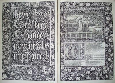
I was struck by how much the visual aesthetics of ornamentation differed from book to book. This was especially true for the Kelmscott Chaucer and the Doves Press Bible. Both are monumental works made with great skill and craftsmanship, and both are beautiful vehicles for their content, but they employ different strategies and produce different reading experiences.

The Doves Press Bible does not have any illustrations, nor does it have any graphic variation in the layout of its pages. The block of type is unbroken, and the reader’s eye can easily run across the lines and words. The type itself is the dominant visual element of the book. This highlights the content, and streamlines the reading experience by focusing the reader’s attention on the words of the story. I found myself drawn in, and I read many parts of the text from several different sections of the book. My viewing experience was calm, focused and clear. This book is special, though, because it manages to be both practical and beautiful: the presence of only the type on the page was not a boring, utilitarian strategy, but gave the book a dignity and restraint that reflect it’s content.

William Morris’s Chaucer is a completely different book. The most amazing parts of it, for me, are the two-page decorated and illustrated spreads. There is so much visual material presented to the eye that for a moment you feel almost overwhelmed by the sheer amount of detail and the scope of the decoration. Using the full two pages together is a very effective way of using the book’s structure to lend even more importance to what is being presented. More than just reading the book, I was exploring the different types of representation it contained: illustrations depicting events from the narrative; the words that communicated the story; and the intricate borders and patterns that link the other two elements together. This book is doing more than just providing a structure through which to absorb a story; it is creating a varied experience of representation and interpretation.

If you asked me which book was more successful, or which one was “better”, I wouldn’t be able to say. They interpret their roles differently, and produce very different experiences in the reader. Both are amazing objects, and I really enjoyed having the opportunity to look at them both and be, for a brief time, in their different worlds.

Morris & Dante Gabriel Rossetti’s “The House of Life”


House of Life

“The House of Life” by Dante Gabriel Rossetti.

Although I was initially drawn to the large size of Morris’s Chaucer, I ultimately gravitated to “House of Life” by Dante Gabriel Rossetti, whom I adored for his involvement with the Pre-Raphaelites Brotherhood. I think Morris’s succeeded in accomplishing the Pre-Raphaelites’ goal of exquisite, elegant forms and vibrant color in their works of art, since “House of Life” and “Sonnets and Lyrical Poems” appear ornate and beautiful while even using a brilliant orange for the versals.

“Sonnets and Lyrical Poems” by Dante Gabriel Rossetti.

Unlike Rossetti’s “Sonnets and Lyrical Poems” book that has limp vellum — “The House of Life” has a harder and faded leather binding. Still, despite of the beautiful and exquisite appearance of the spine in “The House of Life,” I preferred reading from the “Sonnets and Lyrical Poems” because of the spine’s flexibility.


House of Life 03Each of Rossetti’s poems in the “House of Life” begins with orange versals and is in a ragged right alignment. The text’s letterform design appears to be Roman. Some poems are also framed with floral motifs. Such bold design causes for the selected poems to appear more distinct due to the boldness and sharp color of the ink.
I found this book terribly enjoyable because of the visually appealing nature of the vegetable and vine-like decor of the versals. The orange color seemed unusual at first, but it seems like a nice change from the usual rubrications in most of the previous books and manuscripts that we have encountered so far.

I was thinking about what Misha said in her post about having a different, reading experience with books and I think I feel the same way. I feel more attached; or rather, my experience with a book like this — with its lovely, aged surface of the cover to the grainy, texture of the pages seems intimate and so precious compared to when I first read a Rossetti poem in an anthology book where the pages were as thin as a Bible.


Chaucer and Full-Page Illustrations

The book I found most appealing from the first book set was probably Morris’s Chaucer. I really enjoy the full-page, dynamic text/illustration combos – an illustration or smaller text portion in the center of the page, surrounded by wide, floral borders.

I like having a full, detailed page to view. It gives the impression of being about more than just words on a page, but about creating an experience for the reader. Even though the Middle English is often hard to decipher, the illustrations, bold versals, and the intricacy of the page help convey an impression without solely relying on the text.

Rosetti’s The House of Life has a similar, if less crowded effect with several of its pages. It’s great to look at a spread and not just see text, but to see a visual that complements and interacts with the words themselves. It just makes it a more exciting experience for me, as a reader.

Also adding to my Chaucer-favoritism: I’m a huge fan of Chaucer in general. For some reason, I’ve always like the rhythm of his writing and the sound of Middle English when it’s read aloud. This version in particular was fun to page through since the larger size gave the words and illustrations more room for detail. It’s an entirely different experience to read Chaucer’s work in Times New Roman on white Staples paper, versus reading it with versals, borders, and 1896 printing intact. It adds a lot to the text that you just don’t get without the full effect.