Wild Pilgrimage and the Use of Format

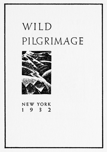
Wild Pilgrimage, third in a series of picture books by prominent woodcut artist Lynd Ward.

It’s a wonder to see how far the class has traveled — through time, past tradition, as the books we read veer in wide arcs from the text-heavy traditional epics of Morris to this, a work with no words. This transition is important. The book is a storytelling tool, after all, and the story usually takes the form of letters, in thick jostling crowds. A book without them is striking. Empty, even. But the image has always been an important part of the artist’s book, and it is refreshing to see it operate as a book’s major medium.

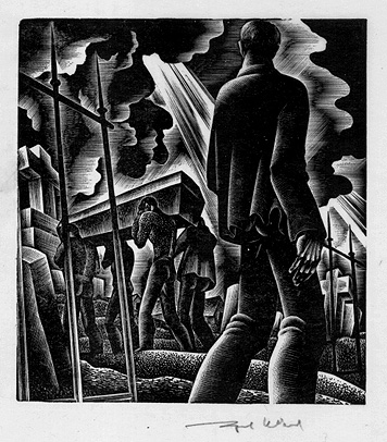
Wild Pilgrimage is, without a doubt, a book of incredible artistic endeavor. The string of woodcuts, which tells the tale of a man trying to liberate himself from an industrial, working-class society, are elaborately planned and brilliantly achieved.There is a stateliness to the book, a constrained quality — each woodcut takes up a single page, and is generally of similar size to its neighbors. Despite the riotous nature of the contents, the trappings of the book remain objective. Cold, even. And in this way, it is not so different after all from Morris’s vision of the perfect geometry, not so different from Cobden-Sanderson’s visual scarcity.

The single eccentricity the book allows itself is a switching of color palette. During the man’s fantasies, the divergence from reality is symbolized by a switch to red-orange ink, a contrast to the somber black reality is painted with. This is the most interesting part of the book in my eyes, and the loveliest aspect of it is its ambiguity — it might take several tries for the confused reader to understand that there are two separate stories being told here. Lack of words creates a silence, and silence births mystery. Everything is shown, not told.

However, beyond this singular shift, the entire book is constrained by its visual geometry. It strikes me now as an odd choice. A book with the title ‘Wild Pilgrimage’, which deals with lynchings, sexual fantasies, revolution, and violent death — these are not topics to be constrained to a square. The sharp, harsh style of the illustrations certainly match the riotous subject matter. The thick shadows and dark faces of the characters contribute to the wordless ambiguity of the story. But the format — the format reflects none of this. Should it?

Although a version of Wild Pilgrimage that escapes its harsh boundaries, that explodes across the page with the strange passion contained in its images, would very much pertain to my interests — it is important to remember where we, as a class, saw this book. Wild Pilgrimage is a book out of the 30s, but that is not the only reason it was placed with the modernist typography guides like Eine Stunde Druckgestaltung or governmental propaganda a la Italia Imperiale. They share a common format, a format that dispenses entirely with the gloss and decoration of Art Deco or the Fine Press. It is a format for clear communication, a tool for the common man, a vehicle for propaganda and public service alike. Functionality is key, and thus the format of a book, even of a wordless, picture-centric one, must follow the same constrained criteria of typography. This modernist sensibility, combined with the constraints of the woodcut medium, appears to have manifested in the strict proportions of Wild Pilgrimage. It’s an interesting example of modernism in a medium normally associated with the fine printers.

Whether this was a successful use of those tenets is too subjective a point to discuss, but it is worth noting that looking at lynchings and revolutions through the clear, unfiltered lens of modernism lends a harshness, callousness, and disconnected industriousness to the book. We have no key cards, no cues from the author about what to think or feel. It is the eye of an uncaring, mechanical world, and perhaps this is exactly what Ward had in mind.


Carolee Schneeman’s Vulva Morphia, the use of Humor, and Feminist Discource

8154_1000

Book Set Ten: Feminist Books

I thoroughly enjoyed our feminist book set. Exploring the ways in which the book has been used as a political object, or rather, a means for dispersing political ideas was really interesting.
Carolee Schneeman’s Vulva’s Morphia, aside from just being visually stunning, is incredibly skillful in its pairing of text an image. I was drawn to the book immediately, not a surprising fact, as the work of Granary Press has consistently stood out to me in our many book sets.
What initially struck me about the book was its humourous text. Schneeman tells the story of a vulva and its experiences encountering important works on theory, sexuality, and feminism. The humour initially stems from the personification of the vulva but, there is a lot at hand in Schneemann’s choice to do this. Using personification, Schneeman shows the ways in which ideas attach themselves to women’s bodies and how feminists seek to alter this discourse.
In many ways self-referential, the humour of the piece likewise comes from investigating the ways in which feminists construct themselves. The text isn’t afraid to poke fun at feminists and the ways in which feminist texts often obscure more than they reveal. In many ways the simplification of these ideas makes them accessible and becomes a point of entry for those interested in feminism.
The text is then juxtaposed with expressionistic portraits of various vulvas. The portraits are mounted onto the book with the text connecting each page as it moves over the inner-hinge of the book. Schneeman positions the text in the book beckons the reader to continue on exploring not only the vulva but, the ideas behind it. The impressionistic portraits work to sustain the reader’s aesthetic interests. The variety among the images allows for a representation of diversity both inside of feminist discourses, and the diversity of female bodies.
I also, think it is worth considering the ways in which feminism, to many an unattractive concept, is placed at the center of an aesthetically pleasing book. That the esoteric nature of the theoretical concepts alluded to by Schneeman are democratized by the books form.
Ultimately, the meaningful and complex nature of Schneeman’s Vulva’s Morphia could be easily lost. But, the combination of text and image within the book forces the audience to confront new ideas and old prejudices.

From Marinetti to Depero

The most strikingly and identifiably futurist books in all of the book sets were Marinetti’s Les Mots en Liberte Futuriste (1919) and Depero’s Depero Futurista (1927). Despite commonalities, the books serve very different purposes. Marinetti’s work instructs the reader on the necessity for words and freedom, and its essential elements and hindrances; the words as image are meant to teach through example as well as critique European relations. Depero Futurista, though heavily reliant on words in freedom, is rooted more in the artist than the technique. Depero’s approach to words in freedom is much cleaner and geometric than Marinetti’s, arguably less politically radical. I believe that this was an intentional choice of Depero’s, one made in part to ingratiate futurism as a movement to Mussolini and encourage him to endorse it.

Marinetti’s Les Mots en Liberte Futuriste revealed and explained the thinking and intentions behind words in freedom, as embodied in his Zang Zang Tumb. He wanted to reduce words to their physicality, prioritizing their most primally tangible qualities; in this way, he transformed them into action. For these word-objects to be as representative of movement and action as possible, Marinetti arranged his mise en page chaotically and unpredictably. Random capitalization, sporadic bolded type, multiple types within words and sentences,  a disdain for symmetry, and a general atmosphere of disorder all contribute to Marinetti’s vision of reality. They represent the destruction of traditional conventions surrounding language, such as grammar and syntax, to act as a parallel to Marinetti’s call for the cleansing burning of the past to fertilize the future.

Depero Futurista, created almost a decade later, is the undeniable child of Les Mots en Liberte Futuriste. However, Depero’s use of words in freedom is much more ordered than Marinetti’s. His rejection of the norms of language are in line with his mentor’s, but his arrangement is not so arresting. Depero’s images are constructed to challenge the view but also to please; they are consistently symmetrical and centered in basic geometry. His text varies in size, thickness, and type but never with the same forceful spontaneity that characterizes Marinetti. This drastically changes the tone of Depero’s words in freedom into one less obviously aggressive toward tradition, toward Italian culture. Futurism loved fascism and sought Mussolini’s public approval from his rise to power, but the critique and dismissal of Italian tradition made it politically unwise for him to do so. Where futurists wanted to eliminate museums and and forget history, fascists wanted to return Italy the power and pride of the Roman Empire. As fascism gained influence and presence within Italy and Europe as a whole, futurists strove for endorsement through compromising the most offensive aspects of their art. I believe that Depero’s use of words in freedom was a clever attempt at maintaining the political implications of the words themselves without supplementing them with politically charged images. Unfortunately, diluting the futurist technique never made it palatable to Mussolini.

Scale: Intimacy and Intimidation

Image

As I was reflecting on the books we’ve encountered in the past few weeks, Julie Chen’s Evidence of Compression stood out in my memory as one of the most intriguing books of the semester. Chen’s structure is immediately striking and unusual. The book appears as a rounded three-dimensional object that resembles a stone or a clam. It takes a few moments of investigation to determine how to open the book, which has one hinge that connects its top and bottom halves. The book itself has a noticeable weight and solidity that enhance its physical presence and mystery as you view and handle the object. Inside the clam structure are two small books with rounded pages that can fan open to create oval structures that represent the pearls of Chen’s Evidence of Compression. Just as the outside structure required physical exploration, the interior books must be held closely, creating an intimate space of exchange. The scale of Chen’s work enables closeness between viewer and the object as successful exploration of its structure and text requires careful examination. As a feminist book, the relationship created by Chen between book and reader emphasizes the forced silence of women and the difficulty of expressing female experience in a patriarchal society. The words of the small books that imply the unspoken by spelling out “words beyond words” on the pages and which are difficult to locate and discern because of the object’s structure, are the Evidence of Compression and the evidence of oppression.

photo-6

Italia Imperiale also manipulates the relationship between book and viewer through scale, but the experience contrasts sharply with that of Evidence of Compression. While Chen facilitates intimacy between text and reader, the grand scale of Morgagni’s book aims to intimidate. The weight and size of the book control how its pages are turned, as strength is required to access the text. Italia Imperiale thus challenges and makes demands of its viewer before revealing its contents. The scale of Morgagni’s book emphasizes the power and importance of Musolini’s regime, and presents Italy’s imperial history in a solid and daunting form that accentuates the nation’s dominance. While Chen prompts cautious consideration by concealing her text in small pages, Morgagni overwhelms with large text and formidable images. In both books meaning is emphasized through presentation, and the creator manipulates engagement with the book in order to communicate the feminist or fascist experience.

Book Set 10: Feminist Books

IMG_20131126_105855 IMG_20131126_110401

It was exciting to see this inspiring and moving collection of Feminist books. The books had a unique characteristic that distinguished them from the other collections that we have inspected in class. Perhaps it is the fact that these books have been made by women, for the purpose of sharing the experiences of women, but each of these books had an innovative and creative means of presenting their books as well as an element of intimacy (in the construction and/or content) that was missing in other book collections.

IMG_20131126_110237

Evidence of Compression is another feat of book arts by Julie Chen. Upon opening the box, it was a surprise and a bit of a shock to find, not a book, but a…rock…maybe it was supposed to be a clam shell. It looked very organic. Within the structure, was a small oval-shaped booklet that looked like a small pearl set within the larger oyster shell. The small structure of the books inherently created an intimate experience reading the book. The two different texts in the pod. The first one I read included black out poetry where the text called attention to social awareness and change. The second text, I found to be more personal and touching. It explained the core of Chen’s project. It discussed Women’s history of oppression in a gendered society. The following passage resonated with me the most:

To understand history

to hold the smooth hardness

of compression and growth

in the palm of your hand…

Upon reading this passage I understood how Chen was trying to give a voice to the female experience. Chen sees the inequality and injustice women have faced (and continue to face) as acts of compression which oppress and limit the agency of women but rather than allow that to stop us from moving forward, Chen illustrates this compression as a building force that women utilize to accumulate power and freedom from a patriarchal society. Hence the initial structure of the book is not to depict a rock or a clam shell at all but rather the strength and stability that women have created for themselves in society through decades of breaking social norms, making their voices heard. In this way, Evidence of Compression  is more than just a work of art, it is also a testament to the struggle of women throughout history and to the revolutionary changes we have and will make in society.

Treading the maze: an artist’s book of daze, by Susan King, is another book which shares an intimate interaction with its reader. Unlike Compression, depicts a single woman’s experience with breast cancer. The most notable feature of the book is its structure, where each page from the right and left side overlap one another. This allows for the reader to choose the order of the pages and the intimate action of delving into the author’s personal, emotional story.

The feminist books of this set are uniquely engaging, personal, and emotional, unlike any of the other book sets. These books are also evidence for why books are still a relevant and important format to engage in. The book format allows for these incredible stories to be shared with a wide audience and to preserve the history and ideals of women throughout time.

Ruscha and Luck – Playing with an element

Night Street by Barbara Luck is unique in its structure and in the way it makes the reader interact with its pages. Twentysix Gasoline Stations by Ed Ruscha is plain in its structure, but makes the reader reconsider artistic expression through the simplistic photos. Both books tell the story of a physical journey but do it in different yet effective methods – Luck’s through tactile elements and Rushcha’s through portraits of gas stations.

20131209_095408[1]

Night Street by Barbara Luck


Twentysix Gasoline Stations by Ed Ruscha (from http://images.search.yahoo.com/r/_ylt=A0PDoQ7duadS6hIAm.mjzbkF;_ylu=X3oDMTBtdXBkbHJyBHNlYwNmcC1hdHRyaWIEc2xrA3J1cmw/SIG=1373vp680/EXP=1386752605/**http%3a//nikosgeorgopoulos.blogspot.com/2012/03/on-ed-ruschas-twentysix-gasoline.html)


Night Street is bound by interacting streets and tabs of different colored papers. This creates an engaging 3-D form that invites the reader into its accordion and open style. The progression through the book is echoed by the arrangement of the prose –the different angles of text mimic the geometry of actual streets and force the reader to take a walker’s point of view. The typography is small and subdued by the context on some of the pages. Having the printed text be small and angled I the plane of the street on the page makes the text seem like signs conveying a message instead of poems to be read. Luck uses black and white images throughout the book but highlights them with added color drawn on and in paper. This highlighting via color blocks and shadowing immediately shows the reader what is important in the street setting.  Luck takes an ordinary idea – book with poetry and images – and altered the structure of the book which creates a tactile progression of the journey for the reader.

20131209_095434[1]20131209_095422[1]

(Page from Night Street shows the text integrated into the visual plane of the image.)


Unlike Luck, Ruscha’s black and white images stand alone on the page but he does alter a single element like Luck. Ruscha wanted his book to be widespread so instead of altering the structure of the book, which would have made it harder and more expensive to produce, Ruscha alters the importance of a typical building specially gas station buildings throughout his trip. Ruscha photographed the stations similar to how a young child would capture their journey. He took normal photos of unnoticed buildings that are ignored in our vision yet revelant and crucial to our modern lifestyles. His style of photography and the book form make Twentysix Gasoline Stations seem like a series of landmark postcards picked up at the stations. But instead of purchasing a card to remember the town his photo of the station not only shows key parts of American culture (the automobile and driving) but also on a literal level he acknowledge the individual stops that make it possible for him to have a trip – almost like a list of donors in a playbill. Ruscha captures landmarks of different significance and does so by not caring about the artistic beauty of the photos but makes them seem novice and causal thus highlighting the iconic presence of these regular daily buildings. His statements use the regularity and simplicity of our lives to question art.

This image from Twentysix Gasoline Stations shows the postcard-like resemblance.  (from http://en.wikipedia.org/wiki/Twentysix_Gasoline_Stations)

Although, the two books are different they are also alike. Both play with one element of the book, using simplicity whether in the idea or the format to provide different audiences with their account of a journey.

New Intimacy

The Fluxus movement pushed boundaries in the hope of redefining the parameters of art. The aptly named Fluxus 1, shows the movement’s obsession with the collective and the varied contributions of multiple artists. Fluxus 1 is filled with instructions for how to engage with the work: “put finger in hole,” “put in 5 envelopes.” The result is a greater intimacy between reader and text. The author aknowledges the discomfort of this active exchange in his selection of bizarre images, such as x-rays of teeth and a photograph of the patch of skin behind an ear. The book is also comprised of various found objects which the audience is invited to contribute. In this way, the reader becomes author.
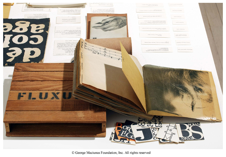
Fluxus 1 is not written or illustrated by George Maciunas, it is “compiled and published” by George Maciunas. The artist’s role has shifted from creator to coordinator. This is also apparent in the work of Sol LeWitt, such as Arcs, Circles & Grids. It is a revolutionary concept that the artist can write a set of instructions to be carried out by others.Among the feminist books from Book Set 10 were Treading the Maze: An Artist’s Book of Daze by Susan King, and The Dickenson Composites by Jen Bervin. The first focused on a woman’s struggle with breast cancer, and the second on a famous poet’s unique annotations and marks. These books approach intimacy from a different angle than in Book Set 9. Through their subject matter, they tell us that a woman’s individual experience is an important and appropriate subject for a work of art.

Book Sets 9 and 10 redefined the concept of artist and art. Art is an experience. Art is life. This new artistic realm is well explored by the Relational Aesthetics movement and by the artist Ai Weiwei. There is a fascinating documentary called “Ai Weiwei: Never Sorry” which I highly recommend. As he says: “I think my stance and my way of life is my most important art.” [youtube]http://www.youtube.com/watch?v=ma6Q03ljdrg[/youtube]

Feminism and the Artist’s Book

For my final blog post, I’d like to bring in conversation Joanna Drucker’s Testament of Women, and Kara Walker’s Freedom: A Fable. These two artists’ books highlight the historically grounded exclusion of women. First, I’d like to give some context about the authors of these artist’s books.

Both female artists have varied experiences that drive their work. Kara Walker (b. 1969), a California native, moved to the South during adolescence. Her works often examine issues of gender, race, power, and history. Walker was also the youngest recipient of the MacArthur “genius” Award, has exhibited her work all over the world. The other artist, Johanna Drucker (b. 1952), is the inagural Breslauer Professor of Bibliographical Studies at UCLA. She is known for her work as a critic, poet, and book artist. Both artists examine gender and history in different ways.

Freedom: A Fable is an illustrated artist’s book that uses pop-ups and silhouettes to convey the African American female experience. Its layout is reminiscent of a children’s book, first, with its cover and codex structure, and simple text. Yet, we learn how complex and intricate each pop-up is, and the emotionally powerful story of a female slave’s challenges after emancipation.

Walker engages with the intersectionalities of feminism, including not only gender, but race. She uses the 18th-century black silhuoette forms that remind us of historical stereotyped representations of African Americans in minstrel shows and literature. Most of Walker’s silhouette art are typically installations that cover entire walls. Freedom lets the viewer interact with these images on a very personal, intimate level.

In contrast, Drucker’s Testament was written in response to Vanessa Och’s Sarah Laughed (a book of essays that retell and break traditional biblical tales to highlight women’s experiences) (Drucker, 2008). The stories of biblical women – Eve, Sarah, Miriam, are retold. By breaking their biblical and patriarchal origins, their lives are brought to the forefront. Drucker challenges the original content and emphasizes their personal experience, recasting this as a feminist book.

Both Walker and Drucker provide important testimony to the feminist realm of artist’s books in different ways. Freedom digs deep into the itnersectionality of race, whereas Drucker paints a picture to Western world’s historical view of gender. Their differing aesthetics are also important to consider. Walker’s two-tone color scheme, traditional page layout (image-text), interrupted by complex and carefully cut pop-ups keep the reader engaged. On the other hand, Drucker’s crude representations of biblical women, leading, diverse typography and layout, are also visually interesting and enliven the page. These female artists challenge the traditional codex in different structural, typographical, and material-based ways that I think, can both be appreciated.

 105098-primary-0-440x400

Freedom, a Fable: A Curious Interpretation of the Wit of a Negress in Troubled Times, 1997
Bound volume of offset lithographs and five laser-cut, pop-up silhouettes on woven paper, 9 3/8 x 8 3/8 in.

DruckerMiriamSm

Testament of Women: A New Translation To & From the Texts, 2006
Printed Letterpress, Linoleum cuts, 40 pgs, 
13 1/4 x 10 in.


Works Cited:

Drucker, Johanna. 2008. “Resident Artist (Guest): Testament Of Women.” Nashim: A Journal of Jewish Women’s Studies & Gender Issues, 15, Indiana Press. Spring 2008, pp. 202-211.


A Black and White World

In my final blog post, I wish to compare both Kara Walker’s book Freedom: A Fable and David Douglas Duncan’s photography book Iprotest!. Personally, both books were thoroughly enjoyable to look through and were very powerful. I also enjoy the fact that despite many aesthetic differences between both books, the works of both Walker and David Duncan make a statement about our society. They capture our attention as the reader and tell us a story, using imagery and text, about the world we live in and the social issues that we must recognize.

Kara Walker’s Freedom: A Fable is a narrative about a young black woman named “N-” who is recently set free after the Civil War. Since most of Walker’s work is based on themes of power, race, repression, history and sexuality, Walker uses the form of the book as a way to channel her commentary on African American history. The book describes the journey of a black woman and her desire to go back home to Africa, a place where having dark skin doesn’t matter, after being abused by her white owner. Walker’s typical large-scale silhouettes of African American women visibly inspire the illustrations of the book. Normally, Kara Walker displays her silhouettes by building circular spaces within a gallery with both an entrance and exit. The viewer is then able to walk into the gallery space and is surrounded by her huge black images that consume them. In comparison, Walker’s book Freedom: A Fable seems to be put together with a similar concept in mind- making her book small in size but intricate to pull the reader closer and closer to its pages making the experience grasping. Walker also incorporates the craft of pop-ups within each page spread which leap off the white pages of the book. This technique makes the physical relationship between the artist and the book as overwhelming as the Walker’s construction of the gallery space but in far more personal way.

Walker’s delicate craft of silhouettes embedded in her artist book addresses different racial stereotypes. For example, some of the pop ups within the pages use representations of slaves alongside southern belles or gentlemen in acts of violence. Unlike Duncan’s book whose detailed photography stimulates certain emotions, the outlines of Walker’s silhouettes do most of the talking. Their illustrative characteristics animate the text that lies on the white pages underneath, allowing both the images and text to work together. Therefore, the words are brought to life by the images, which I find powerful. Finally, Walker constructs her pop ups in such a way that she makes her the outlines of her images as detailed and realistic as possible. In order to do so she adds layers and depth to the pop-ups giving them photographic characteristics.

David Douglas Duncan’s Iprotest! works in a similar way as Freedom: A fable. The book consists of both text and image however the photographs remain flat on the surface of the page spread rather than popping out. Being an American photojournalist, Duncan uses his photographs from the Vietnam War to construct a book that conveys the horror of being at war. He alternates between combinations of singular black and white photographs to a series of photographs positioned beside one another to keep the viewer interested. Like Walker’s contrast between bright white pages and black pop ups, Duncan’s photographs consist of high contrast levels that almost separate the black elements of the photograph from the white. This gives the photographs a “pop-up” effect linking Duncan’s work directly to Walker’s artist book. Duncan also embeds differently composed photographs, some being portraits and others landscapes. The details of each photograph are deeply focused and intricate that they strongly convey the effects of war on American soldiers to the viewer.

Daniel Douglas Duncan also incorporates text in his photography book, but uses it differently. Unlike Walker, who weaves her text through the white gaps that are formed by her pop-up silhouettes, Duncan discusses the meaning of his photographs at the beginning of the book and allows his shots independently take over the main body of the book and speak for themselves. Therefore, the text at the beginning of the book acts as though it is setting the stage for the readers while the photographs illustrate the story. Since Duncan’s photographs are powerfully composed, a written explanation of each one isn’t as necessary as it is for Kara Walker’s artist book!

Photography books have always caught my attention. I strongly feel as though photographs displayed on their own can be very powerful but when put together in the book can tell a story better than words can. Because I have a huge fascination with photojournalism, David Duncan’s photographs caught my attention immediately.. Similarly, since Kara Walker’s pop up silhouettes looked as though they were inspired by photographic elements (such as realism) that were put into a book form. I had never seen her work on display in a gallery and felt lucky to experience it at a personal level, which drew me into the narrative that Walker put together. In conclusion, both works moved me. Through Freedom: A fable Walker was able to discuss the issues of being an African American. In comparison, Daniel Douglas Duncan’s Iprotest! was able to illustrate the life of soldiers at war and how much war affects them.


kara 2  Freedom a Fable (Pop-up example)Walker_Fable-13 Freedom a Fable (Illustrative outlines)Karawalkerb E.g of Kara Walker’s Gallery Exhibitions lf Freedom a Fable (Pop up as depth)url Iprotest- (Deep contrast level-pop up effect)ea3bfc8551c936704cfbff2abd46de89 00c8851beeea67364f88e32942593906 Iprotest (Soldiers)

unnamed Iprotest- (Layout example)

Russia in Color

Cover_sketchbook       PP_04

I found that Kiev by The Sochi Project (text and photographs by Rob Hornstra) and La Prose Du Transsiberien by Blaise Cendrars and Sonia Delaunay-Terk had more in common with one another than their country of origin.  It is true, both books are from and about Russia, but I was drawn to the similarities between the treatment of color, text, and untraditional binding methods of each book.

o9EgjXDrWJjb3GeOGNnY9zjqprose2

The Sochi Project is an ongoing endeavor by a small group to document the transformation of Sochi, Russia into the site of the 2014 Olympic Games. Kiev is one of several volumes of The Sochi Project, and it features photographs by Rob Hornstra.  On working with an old Russian camera, Hornstra commented, “I photographed things that I had never seen through the lens of my Mamiya.” Kiev, with its brilliantly vibrant color photographs (printed from color negatives, instead of digital files) serves as an ode analog photography and the past and tradition the medium represents. The book, printed on cardstock folded origami style, is actually one large sheet of paper that can be unfolded and viewed from both sides. For Hornstra, this project was about seeing the world through a new lens (pun kind of intended) and communicating this experience in a simple yet effective structure.the-sochi-project-kievprose-siberien

La Prose Du Transsiberien is poem that tells the story of a train trip taken by the 16 year old poet on a journey from Moscow to Mongolia during the Russian Revolution of 1905.  While only 60 of the 150 planned copies were printed, the intention was to have the total length of all 150 books equal the height of the Eiffel Tower.  This was to turn the book into a symbol of modernity, which  was reflected in both the text and prints featured in the book.  Different fonts were used to suggest movement and mood, while the artist played with color and shape to create visual rhythm that would stand on equal footing with the text.  La Prose Du Transsiberien is made of four large sheets of paper that have been glued together and folded accordion style.  Like Kiev, La Prose Du Transsiberien’s pages can be viewed individually, or as a cohesive work. While Kiev features far less text than La Prose Du Transsiberien, both books use color to evoke feeling, understanding, and excitement for the viewer. Both books are printed on decent, but not extravagant paper, and can be folded into a manageable size. I was drawn to these books as they both utilize the juxtaposition of color to communicate the experience of a specific place and time in Russia. In essence, process and material are what makes both of these books effective and compelling.

PBA_08_05_2013_048

060412_binoche_zoom