Blog Post 1: On the fabric of the human body

From all the books we looked at in Book Set One, De Humani coporis fabrica librorum epitome by Andreas Vesalius stood out to me the most. Christophe Plantin published the book in 1565 during the Renaissance and it is known to be one of the most influential books on human anatomy. The reason why I was drawn to it more than some of the other books was because of its cover (figure 1). I was drawn to its aged texture and faded color. If you look closely at the cover of the book you can see beautiful designs that once decorated the front and back of the book. These designs are done on pigskin, which is the material that the cover of the book is made of.  When you open the book to its front page you can see the signature progression of owners that once used the book for reference and information.

The book is based on Vesalius’s lectures in which he dissected corpses to illustrate the information he was discussing with his students. It presents detailed examinations of the different parts that make up the human body (figures 2 & 3). Vesalius was able to produce these stunning illustrations by engraving copper. The details of the illustrations make them act like beautiful drawings but also serve the purpose of informing people about the human body.

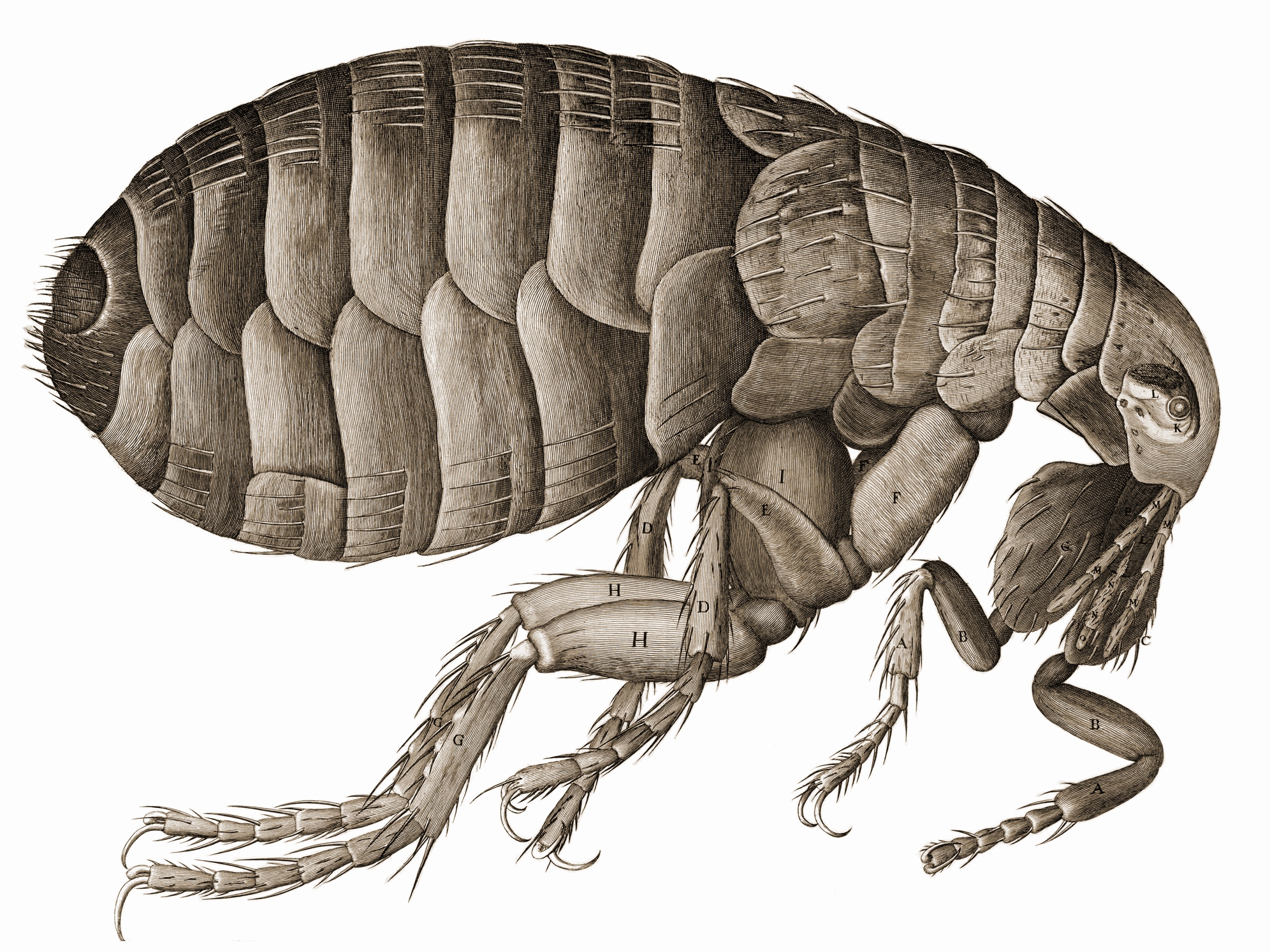
De Humani Coporis fabrica librorum epitome is laid out in a way that makes it seem like a scientific diary. The illustrations work with the text (which is a mixture of Roman Capitals and miniscule type form) using a labeling system. Each part of the diagram is labeled with numbers or letters that are then explained in a detailed description on the page next to it. Both the text and images work together to help the reader match and understand what part of the human corpse he/she is observing. Figure 4 is a perfect example of this “labeling system” and also of what the other pages in the book look like.

.  figure 1 (figure 1)

figure 2 figure 3  (figures 2 &3)figure 4 (figure 4)


Book Set One: “Micrographia”

Micrographia by Robert Hooke most caught my attention because of the exquisitely detailed illustrations of insects and its reflection of the 17th century’s cultural and social changes towards science and nature

The book was published in 1665, at a time when Europe was in the middle of the Enlightenment. There was a burgeoning quest for knowledge and individualism and as a result, new technologies were developed to observe and expand our understanding of the world. Micrographia is the result of this profound excitement and  perfectly reflects the Enlightenment’s dedication to discovering new frontiers in science.

In many ways, Micrographia, for all of its scientific information, reminds me of a children’s picture book. The exquisitely detailed illustrations of smaller organisms are quite literally magnified in a fold-out format larger than the book itself. This displays the intention to teach readers and to glorify the wonders of the microscopic world.

Along with new scientific instruments like the telescope, new developments in book illustrations served to exhibit the discoveries of the Enlightenment era. Unlike its woodcut predecessor, the copper plate engravings allow for a fuller, softer illustration and as a result, a more accurate portrayal of the organisms. The text and the illustrations were structured to fit the educational function of the book. Commonly, there would be an illustration followed by the name of the organism and a short description of said organism. An interesting not about the text was how it seemed to characterize each insect. For instance, the louse was seen much more as a ubiquitous nuisance than the flea. While it was humorous for me, the text’s familiarity with the insects also reflects urban life during the 17th century.

Book Set One (Evanleigh Davis)

(I think this is the correct place to write a blog post — if I’m wrong, I’m really sorry.)

The book I’d like to discuss is Night-Thoughts on Life, Death, & Immortality, authored by Edward Young and illustrated by William Blake.

In the historical context, this book is relatively lackluster. It was made in 1797, setting no historical landmarks (a la the Gutenberg Bible), and never considered a historical staple in book history (a la The Nuremberg Chronicle). Its attraction was more of a personal one. The use of narrative illustration juxtaposed on word, fiction or poetry in particular, has always intrigued me greatly, and Night-Thoughts is a splendid example in this regard. William Blake is always a favorite, and his sinuous, energetic watercolor engravings seemed a perfect match for Young’s poetic venture through themes of death and mortality. I’ve researched the book since I first saw it, and am pleased to know that Blake’s gigantic project (537 watercolor illustrations, 200 of which were replicated through engravings) has at last been drawing the historical eye in recent years.

Of course, the other books offered in this set offered illustrations; and the Micrographia and the Encyclopedie both boasted engravings earlier than Night-Thoughts did. The reason I focus on Night-Thoughts in particular goes beyond my appreciation for poetry, fondness for William Blake, and personal attachment to watercolor paintings. Unlike the two non-fiction texts mentioned above, Night-Thoughts is entirely unclinical with its treatment of its illustrations. I adore it when images and text are entangled inexplicably, so that they resemble a single symbiotic organism; I loathe the dividing line. The nature of Blake’s illustration was one of rich liveliness, and they rarely were contained on the pages. The figures would crawl up the edges of the poetry above them, intrude into paragraphs, fall down margins. The spontaneity this creates is both brilliant to leaf through and, narratively speaking, the perfect treatment of Young’s poetry. I’d be interested to know if examples of similar word-illustration combinations existed in that time period.

– Evanleigh Davis

Book Set 1

I don’t know about you all, but I felt the need for a visual supplement to the readings to truly understand the process of early printing. These two videos were quite enlightening.

The first is a video of the press, the second is of casting the metal type.

[youtube]http://www.youtube.com/watch?v=ksLaBnZVRnM[/youtube]

[youtube]http://www.youtube.com/watch?v=u–84uPhNSU[/youtube]

(there is a little bid of an audio overlap in the second video, but it is only for a few seconds)

The throw when the metal is poured into the mould made me nervous. It doesn’t look like the man in figure 8.1 from the reading was wearing a glove. Not only was it a challenging job, it was dangerous as well!