Book Set 10: Feminist Books

IMG_20131126_105855 IMG_20131126_110401

It was exciting to see this inspiring and moving collection of Feminist books. The books had a unique characteristic that distinguished them from the other collections that we have inspected in class. Perhaps it is the fact that these books have been made by women, for the purpose of sharing the experiences of women, but each of these books had an innovative and creative means of presenting their books as well as an element of intimacy (in the construction and/or content) that was missing in other book collections.

IMG_20131126_110237

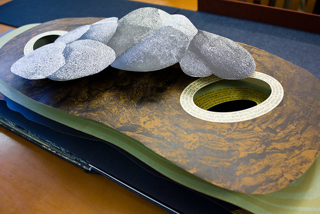
Evidence of Compression is another feat of book arts by Julie Chen. Upon opening the box, it was a surprise and a bit of a shock to find, not a book, but a…rock…maybe it was supposed to be a clam shell. It looked very organic. Within the structure, was a small oval-shaped booklet that looked like a small pearl set within the larger oyster shell. The small structure of the books inherently created an intimate experience reading the book. The two different texts in the pod. The first one I read included black out poetry where the text called attention to social awareness and change. The second text, I found to be more personal and touching. It explained the core of Chen’s project. It discussed Women’s history of oppression in a gendered society. The following passage resonated with me the most:

To understand history

to hold the smooth hardness

of compression and growth

in the palm of your hand…

Upon reading this passage I understood how Chen was trying to give a voice to the female experience. Chen sees the inequality and injustice women have faced (and continue to face) as acts of compression which oppress and limit the agency of women but rather than allow that to stop us from moving forward, Chen illustrates this compression as a building force that women utilize to accumulate power and freedom from a patriarchal society. Hence the initial structure of the book is not to depict a rock or a clam shell at all but rather the strength and stability that women have created for themselves in society through decades of breaking social norms, making their voices heard. In this way, Evidence of Compression  is more than just a work of art, it is also a testament to the struggle of women throughout history and to the revolutionary changes we have and will make in society.

Treading the maze: an artist’s book of daze, by Susan King, is another book which shares an intimate interaction with its reader. Unlike Compression, depicts a single woman’s experience with breast cancer. The most notable feature of the book is its structure, where each page from the right and left side overlap one another. This allows for the reader to choose the order of the pages and the intimate action of delving into the author’s personal, emotional story.

The feminist books of this set are uniquely engaging, personal, and emotional, unlike any of the other book sets. These books are also evidence for why books are still a relevant and important format to engage in. The book format allows for these incredible stories to be shared with a wide audience and to preserve the history and ideals of women throughout time.

Book Sets 5&6: Wordswordswords and Panorama

Critics such as Drucker and Zweig make important and valid points about Artist’s Book’s place in the art world, highlighting the difficulty of creating a concrete criteria for the genre. The main cause for their concern is that “the junk…that is being produced under the rubric of AB’s will just drag the level of production and conception to an impossible low. In examining Book Sets 5 & 6, I find a diverse and interesting assortment of books that each present an interesting concept to the table.  I would like to discuss Wordswordswords by Edwin Schlossberg, Robert Raushenberg and Jasper Johns, and Panorama by Julie Chen as ideal representatives of what artist’s books and do and be.

Wordswordswords sets out to explore the different ways in which we think about and interact with language. The artists utilize a variety of mediums in order to share this concept with the reader, allowing him or her to experience forms and structures of language. For example, the book contains pages made of transparent film and metal-like sheets. The book also applies different fonts, font sizes, and text formats to address the different ways the reader interacts with his or her text; each new page is a playful, new experiment with language. I had the opportunity to delve into a page that used three different sheets of transparent film, each with lines of text that (when all the pages were stacked together) formed a cohesive narrative. This structure let me experience a variety of different text since I could form a number of phrases/poems with different sheets; each one creating different meaning and aesthetic every time. The font size was small so I was forced to carefully examine the text and have an intimate interaction with the words. At the same time, the intimacy was brought into contrast with the transparency of the sheet which innately brought my environment into view as the background to my text.

What I like about Livres D’Artiste books is that they oftentimes take pre-established works or texts such as poems, or in the case of Chen’s Panorama, environmental awareness content and reintroduces, expand the way I interact with them—the familiar becomes new, again. Panorama serves as a book about Life, the World, and Human existence through engaging structures. I found that the texture and layers of the book enticed me to engage in the reading panels. For example, there were several pages with different panels that provided eerie message. I could also form different messages with different panels.  What most attracted me to this book was the large, pop-up “towers” which seemed to erupt out of the page. Each layer of the “tower” had different content or continuous script throughout and I had to investigate, literally, into the page in order to understand what message Chen was trying to convey. This book brought text and the book format into a profound and lively new light.

Book Set Four: Jazz and A Toute Epreuve

The two books that most captured my attention were Jazz by Henri Matisse and A Toute Epreuve by Paul Eluard. Both books harness the colorful and youthful art work of famous artists to create playful works of art. The intensely vivid presentations are a testament to the new and exciting ideals of the Livre D’Artiste movement in Europe.

Eluard’s A Toute Epreuve effortlessly utilizes free-form and open field of the book format.  Miro’s fantastic illustrations remind me of a child’s drawing with the use of primary colors and abstract shapes. I also appreciate how he adds different textures with woodcuts to reproduce a wood grain pattern on the page. The combination between Miro’s prints and woodcuts inserts an immediate and organic motif to the book. In seeming contrast between the youthful illustrations, A Toute Epreuve’s text is in black type font, simplistic, and in block format. However the natural aesthetic of the illustrations work in tandem with the text to utilize space and movement in order to support the context of the page, ultimately creating a very enjoyable and vivid read.

Henri Matisse’s book Jazz separates the text from the illustrations but produces a full visual spread that exudes movement and energy. Matisse’s control of both the artistic and textual image probably factors into the completeness of this book. The pochoir technique lends itself to the dense and bold colors which are appropriate for the kind of book. The bright collage on each page mirrors the text of the book. Matisse chose to use his own handwriting to produce the text, filling the entire page with his large, flowing cursive. The side-by-side positioning of the text and image facilitates an intriguing visual rhythm between the illustrations which flows into the text.

Both these books embody the successful collaboration between artist and publisher. Both Jazz and A Toute Epreuve incorporate the ingenious talent of their artists with the vision of the publisher to successfully conceive a thoroughly engaging and stimulating type of book.

Book Sets 2&3: Fine Printing

Fine Printing elevates the book beyond its functional purpose and presents the book as Art. Those in fine printing believed that the book must be made with the highest standards, involving quality, handmade paper, as well as superior binding with fine materials. Similar to the Arts and Crafts Movement, the Fine Press Movement sought to bring aesthetic beauty and visual pleasure to a market of shoddy, mass-produced books.

In Book Set 2 one of the books that really caught my attention was The Wood Beyond the World  by William Morris. It clearly reflects the influence Morris received from 15th century books, utilizing the dark, bold typographical colors of black and red. In accordance with his own standards of what a perfect book should look like, The Wood Beyond the World maintains large outside and foot margins, as well as quality vellum binding. In addition, Morris used a gothic font to print the text but instead of appearing cluttered the font letters had room to breathe and were quite legible. One of the most exquisite features of this book was the woodcut illustrations, the nature motif borders and intricate illustrates were expounded by the excellence of the book itself.

In Book Set 3, Harold McGrath’s The Adventures of Huckleberry Finn has a particular hold in my memory because I had never seen a familiar text presented in such a beautiful format. This book follows Morris’s ideals to a T, the pages are clear and easily read, and the type is well designed. Furthermore, McGrath utilized space and whiteness throughout this book, utilizing large and bright pages along with large and comfortable print. Congruently, the illustrations by Smith’s very own, Barry Moser, are bold portraits centered on the white page and given plenty of breathing space. The book is a visual masterpiece.

While I was looking at The Adventures of Huckleberry Finn, I could not help but think of this edition as a perfect embodiment of the issues with Fine Printing. The Adventures of Huckleberry Finn is an American Classic taught in highschools and colleges throughout the nation and is therefore, readily available in the mass-market. Michael Russem would have abounding criticism for this book; he would say that McGrath’s printing of the book is extravagant and counter-intuitive to the functionality of the book. In comparison to mass-produced paperback copies McGrath’s edition is admittedly very large, heavy and pricey. It is certainly not ideal for classroom use nor is it accessible to the broke college student. However, it is crafted with reverence towards the text and the book form itself. It is beautiful as it exists as Art and succeeds and enticing me as the reader to interact with the text.

Book Set One: “Micrographia”

Micrographia by Robert Hooke most caught my attention because of the exquisitely detailed illustrations of insects and its reflection of the 17th century’s cultural and social changes towards science and nature

The book was published in 1665, at a time when Europe was in the middle of the Enlightenment. There was a burgeoning quest for knowledge and individualism and as a result, new technologies were developed to observe and expand our understanding of the world. Micrographia is the result of this profound excitement and  perfectly reflects the Enlightenment’s dedication to discovering new frontiers in science.

In many ways, Micrographia, for all of its scientific information, reminds me of a children’s picture book. The exquisitely detailed illustrations of smaller organisms are quite literally magnified in a fold-out format larger than the book itself. This displays the intention to teach readers and to glorify the wonders of the microscopic world.

Along with new scientific instruments like the telescope, new developments in book illustrations served to exhibit the discoveries of the Enlightenment era. Unlike its woodcut predecessor, the copper plate engravings allow for a fuller, softer illustration and as a result, a more accurate portrayal of the organisms. The text and the illustrations were structured to fit the educational function of the book. Commonly, there would be an illustration followed by the name of the organism and a short description of said organism. An interesting not about the text was how it seemed to characterize each insect. For instance, the louse was seen much more as a ubiquitous nuisance than the flea. While it was humorous for me, the text’s familiarity with the insects also reflects urban life during the 17th century.