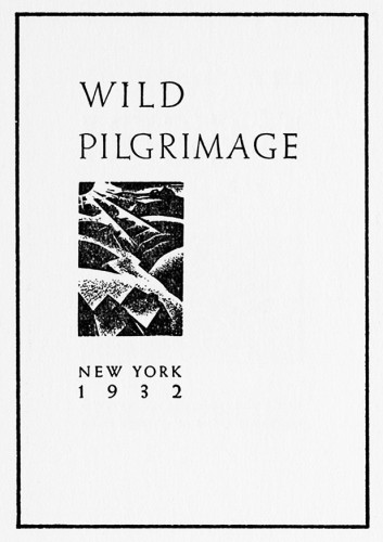
Wild Pilgrimage and the Use of Format

Wild Pilgrimage, third in a series of picture books by prominent woodcut artist Lynd Ward.

It’s a wonder to see how far the class has traveled — through time, past tradition, as the books we read veer in wide arcs from the text-heavy traditional epics of Morris to this, a work with no words. This transition is important. The book is a storytelling tool, after all, and the story usually takes the form of letters, in thick jostling crowds. A book without them is striking. Empty, even. But the image has always been an important part of the artist’s book, and it is refreshing to see it operate as a book’s major medium.
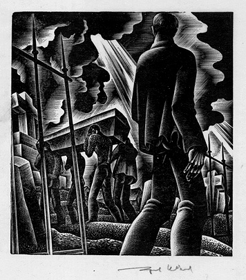
Wild Pilgrimage is, without a doubt, a book of incredible artistic endeavor. The string of woodcuts, which tells the tale of a man trying to liberate himself from an industrial, working-class society, are elaborately planned and brilliantly achieved.There is a stateliness to the book, a constrained quality — each woodcut takes up a single page, and is generally of similar size to its neighbors. Despite the riotous nature of the contents, the trappings of the book remain objective. Cold, even. And in this way, it is not so different after all from Morris’s vision of the perfect geometry, not so different from Cobden-Sanderson’s visual scarcity.

The single eccentricity the book allows itself is a switching of color palette. During the man’s fantasies, the divergence from reality is symbolized by a switch to red-orange ink, a contrast to the somber black reality is painted with. This is the most interesting part of the book in my eyes, and the loveliest aspect of it is its ambiguity — it might take several tries for the confused reader to understand that there are two separate stories being told here. Lack of words creates a silence, and silence births mystery. Everything is shown, not told.

However, beyond this singular shift, the entire book is constrained by its visual geometry. It strikes me now as an odd choice. A book with the title ‘Wild Pilgrimage’, which deals with lynchings, sexual fantasies, revolution, and violent death — these are not topics to be constrained to a square. The sharp, harsh style of the illustrations certainly match the riotous subject matter. The thick shadows and dark faces of the characters contribute to the wordless ambiguity of the story. But the format — the format reflects none of this. Should it?

Although a version of Wild Pilgrimage that escapes its harsh boundaries, that explodes across the page with the strange passion contained in its images, would very much pertain to my interests — it is important to remember where we, as a class, saw this book. Wild Pilgrimage is a book out of the 30s, but that is not the only reason it was placed with the modernist typography guides like Eine Stunde Druckgestaltung or governmental propaganda a la Italia Imperiale. They share a common format, a format that dispenses entirely with the gloss and decoration of Art Deco or the Fine Press. It is a format for clear communication, a tool for the common man, a vehicle for propaganda and public service alike. Functionality is key, and thus the format of a book, even of a wordless, picture-centric one, must follow the same constrained criteria of typography. This modernist sensibility, combined with the constraints of the woodcut medium, appears to have manifested in the strict proportions of Wild Pilgrimage. It’s an interesting example of modernism in a medium normally associated with the fine printers.

Whether this was a successful use of those tenets is too subjective a point to discuss, but it is worth noting that looking at lynchings and revolutions through the clear, unfiltered lens of modernism lends a harshness, callousness, and disconnected industriousness to the book. We have no key cards, no cues from the author about what to think or feel. It is the eye of an uncaring, mechanical world, and perhaps this is exactly what Ward had in mind.


The WunderCabinet and an argument for beautiful vacancy

I have my personal gripes about Janet Zweig’s and Johanna Drucker’s purse-lipped critiques of the artist’s book. Their approaches have many unfortunate things in common beyond sheer contrariness (both authors, for example, approach the entirely subjective world of artist books with the single-mindedness of a scalpel). But for the purposes of simplicity and at the expense of several genuinely important and well-made points from both sides, I am simplifying their complaints into a single issue: the argument between style and substance.

Not a balanced argument by any means. Style is considered the flourishy and meaningless fodder for the masses, while substance is the meat of the matter — the stuff we’re really looking for… Consider Zweig’s condemnation of “crafty overproduced luxury items” in favor of “rich temporal experiments, books that do participate in the conversations and challenges of contemporary art”. Now read from Drucker: “Overproduction is particularly deceptive since it tends to confer importance simply through conspicuous display.” For both authors, style is the shallow, preening younger brother; an early indication of staleness, derivativeness, and meaninglessness. Not a work worth liking, in other words.

With this in mind, I will discuss The WunderCabinet: the Curious Worlds of Barbara Hodgson & Claudia Cohen. 

Wundercabinet 3


Here it is. A beautifully designed wooden box cover, containing a miniature facsimile of an antiquarian wunder-cabinet — a place in which to display your fanciful collection of foreign, exotic trinkets from around the world. Somewhere, Zweig is turning restlessly in her bed and muttering ‘crafty overproduced luxury items’ under her breath.

It also contains a journal, written and illustrated by the two artist-authors and built to resemble an old travel-journal. The writing discusses natural history, archaeology, astronomy, mathematical principles, and historically important wunder-cabinets (such as that of Manfredo Settala, a Milanese wood-turner with a collection on the sciences). However, if we’re being honest with ourselves, that isn’t what draws our eye when we open the book.

Wundercabinet


I’ll admit it, I stared at the star charts, stratigraphy plots, pressed plants, hand-inked heiroglyphs, alphabet grids, and sketches of ammonite shells first. They’re beautiful, they obviously took an incredibly long time to make, and substantively they are utterly meaningless. Unless you consider a rangy and breezy education on the contents of wunder-cabinets to be a participation in ‘the conversations and challenges of contemporary art’, of course. It would take some stretch of the imagination.

Wundercabinet 2


Here arises the difficulty with the ‘style vs. substance’ dichotomy. According to Zweig, an artist book such as the WunderCabinet is an object to be marveled at and then put aside. There is no deeper, richer meaning to it, nothing to return to but the same pictures and pressed plants. It is beautifully vacant of meaning, it is a dressed-up corpse — it would not be very useful on a desert island, in other words. (Neither would a novel, really, unless it tells you how to build a raft.)

But I can tell you personally that there is no other book I would rather return to. In fact, out of every artist’s book displayed in this class, the WunderCabinet is the only one I have requested to see extracurricularly; I have read it from cover to cover; if you were to give me one of the books from the Smith Collection for free, then you would be crazy, but I’d know exactly the one I’d want. It was inspiring. I took notes.

Zweig compared the experience of reading a good artist’s book to watching a good movie or excellent theatre, and I believe this is revealing. Cinema’s critical darlings may fit her criteria, but what about movies like The Avengers or Shrek? They aspire to no ideal, no high-browed message, no contemporary issue of importance. They aim to entertain only, and they have left their big-budget, cerebrally vacant fingerprints smeared upon the face of American culture while doing so. I would watch these movies again and again, but the sole difference between them and the intellectually underwhelming artist books Zweig so despises is a slightly heftier price tag.

This is a gross oversimplification of the issue, of course, yet the merits of the beautifully vacant book should still be discussed. Aesthetic beauty can inspire… Zweig compares the artist book to a narrative-driven novel, which is valid; but the artist book lies upon the bridge between the novel and the work of art, and its connection to the latter has been largely, and unfairly, ignored.


Orchestration in Image (Book Set 4)

I admit I’m naturally inclined toward the traditionally illustrative styles of Fables, a lovely livre d’artiste with sumptious woodcuts by Marc Chagall. I say naturally inclined because that is the sort of illustration I myself enjoy making: it can be visually distinct and stylistically unique, and Fables is certainly both of these, but it is also fairly literal.

Fables

Fables

The narrative bends it around its knee. It is a visual aide, an important crutch to be sure, but also one that can plausibly be dispensed with. Fables is a masterwork in its own right, one could argue, and in no need of visual supplement. Looking at writings done specifically for the livre d’artiste, however, one sees an entirely different pattern.

Jazz

Jazz


One of abstraction. I use an example from Jazz by Henri Matisse here, because in this case, the pictures were created before the writing, a far rarer occurrence than the opposite. The result — and this is a phenomenon that I noticed in class and will investigate here — is a visual noise. Bereft of literal interpretation, bereft of clear, uncomplicated connection between text and picture, the audience turns to the metaphor of a song, a symphony. I noticed this language used in class. Take Jazz as a starting point. The writing in that case is huge and handwritten, scrawled, really. Looping and gentle and light, it’s fairly easy viewing, and certainly provides intense contrast with the thick, juicy gouache that coats the visual pages. And there it was said in class: it’s almost like a blast of noise, somebody said; it’s so much louder than the writing, we observed; the term ‘visual cacophony’ was thrown about somewhere. The title ‘Jazz’ is appropriate; it draws to mind improvisation, robust and free — and these are things the writing and the art have in common.

Or take A Toute Epreuve, another classic. Whereas Jazz draws thick lines between text and image, A Toute Epreuve muddles them together to form a soft, bouncy, spotty sort of tune — a melody that draws its greatest strengths from its judiciousness, its use of the silent space. Its two components, literary and visual, tangle amongst themselves and fall apart again, weave across and behind and before one another to form something akin to a bright, quivering whistle, or an elastic piano tune, or maybe both. The visuals couldn’t make less sense to a Frenchless observer, and there are points where they resemble a baffling batch of squiggles — at least to my narrative-mired illustrative eye. But there is more than one way to represent narrative.

Miro

A Toute Epreuve

Narrative is rhythmic, after all. Even strings of poems, as was the case with A Toute Epreuve, are set in a particular order, a strategic dipping and climaxing of passion and punch. A text with no rhythm is merely an orchestra warming up. Any genius that springs from it can only ever be accidental.

My favorite example, which I’ve saved for last, is Le Chef-D’oeuvre Inconnu, illustrated by Picasso. Apparently, the famous artist grew fascinated by the source material — and it shows, for the work is the most interesting combination of image and word.

Picasso

Shown here is a section of Picasso’s lengthy foreword. The idea of a foreword being made entirely of image is a fascinating one in its own right, but the pertinent detail here is the build of image up to the words. The deceptively simplistic line-and-dot sketches begin small and grow in size and complexity until they become more akin to what you see above — until they sprawl over entire pages, until they become a vast and intricate labyrinth of black-and-white, and until they terminate suddenly where the story begins. The obviously intentional buildup reminds me strongly of the overture of a musical — a choir of erratic violins hissing up an alien introduction to the strange story about to take place.

This foreword, more than anything else, made me realize the rhythmic and orchestral potentials of accompanying illustrations. I hope I see other illustrated artist books that take advantage of this avenue just as passionately.


A bit of devil’s advocate (Morris and Book Set 3)

I don’t think I appreciate William Morris as much as people are saying I should.

I mean, his influence is entirely without question — he’s the Osamu Tezuka of the fine book trade. It’s just that instead of Astro Boy and Black Jack, we get curmudgeonly lectures about uneven margin sizes and the unspeakable atrocities of Bodoni. He’s the one who stoked the fires under the dormant artist’s book; he’s the immaculately high standard most contemporary bookmakers still hold themselves to; you can see his neat, high-quality fingerprints peppering nearly every stand-out fine press book of this century. I guess he deserves it, doesn’t he? He was an icon, wasn’t he? Sure, I mutter into my shirtsleeves.

I want to assert: I really enjoy his books. That edition of Chaucer, mm. If that thing were a dinner it’d have rib-eye in it. Honestly, I wouldn’t have any beef with Morris if he were simply a particularly venerable fine-bookmaker from the long line of 20th century fine-bookmakers. But he’s the standard, the rule, and what a stringent rule it is. So stringent that it might be riding up the industry’s behind a bit. I can’t help but wonder what would have happened if the fine press movement was kicked off by someone else… Someone less ideologically wince-worthy, maybe.

These thoughts occurred to me while I was reading Tom Taylor’s ‘We Can’t Just Stop’ article on bookmaking. I hadn’t read an open declaration and discussion of the fine press industry’s relative obscurity in the overcrowded publishing industry before, so that was fairly enlightening. Why bother creating books using the press, Taylor asks, if the process is expensive, toilsome, and rendered relatively obsolete by a century’s worth of bookmaking technology? His conclusion, interestingly, did not involve any blind reverence of history or self-assured mustache-twirling at the lazy, new-fangled technologies of the gluttonous masses. Taylor understands (with a refreshing amount of both self-reflection and good cheer) that straddling the pompous high-horse of the past does nothing to negate modern bookmaking’s swiftness, proliferation, success, and ease of use. Mass manufacture does not a villain make.

Instead, Taylor returns to his art because of its intimacy, its freedom, its handiwork, its community. Everything that a small-market, high-expertise art form provides. He revels in the creativity bloomed of restriction, because it’s the spirit that counts. And I agree, as an aspiring art major staring down a road of almost certain financial struggle and piddling formal recognition must agree. And here is where Morris most grates on me… His strident promotion of historical techniques over the siren’s call of industry appears to be entirely missing the point — and doing so with an annoying fastidiousness. Alright, so his ideal of the content master craftsman is admirable (if unrealistic). But would he rather a craftsman put great pride and personal character into his or her work — or would he rather them adhere to the strictest of typographical, aesthetic, and material restrictions? I admire his desire for the individual masterpiece, sure. But picking and choosing between ‘acceptable’ and ‘unacceptable’ materials, compositions, or artworks — it seems like its setting immense and arbitrary restrictions on the entire field, and Morris was only just laying down said field’s cornerstone at this point. Experimentation certainly wasn’t on his lengthy and bullet-pointed agenda.

See, just one example and I’ll shut up. Take The Adventures of Huckleberry Finn, the 1985 edition illustrated by Barry Moser. It’s got the golden-mean margins, the roomy, light roman text, the luscious full leather binding, the wood engravings. Morris stuff. But it’s huge. There are people on my dorm floor that are thinner than that damn thing. So, most likely to cut cost, Moser decided to use factory-manufactured paper. High quality, of course — thick and durable — but a book reader can tell at a glance that the book isn’t handmade from spine to fore-edge. An experienced book-maker might even judge it for that. And according to Morris — in so many words — this slip in unspoken book protocol is unacceptable.

It’s a great book. I’m pretty sure no-one’s judging. And I think most of the book-making industry is perfectly willing to ignore and forgive Morris’s eccentricities. But the idea that this craft elitism still lurks over the field like a bad smell makes me want to kick cats.


Book Set #2 – Cobden-Sanderson

For Book Set 2, I’ll be focusing on ‘Cobden-Sanderson and the Doves Press: Arts and Crafts Typography’, a composite of all books printed by the Doves Press in its approximate sixteen year lifespan.

A finely crafted book itself, as if to mirror its prestigious contents, ‘Arts and Crafts Typography’ (as I will refer to it throughout the rest of this post) was interesting to me not because of its aesthetic beauty. Yes, the paper it was printed upon is obviously handmade; it utilizes various shades of roman types, including a particularly elegant italic introduction; and it certainly bears the heavy coloring of a Cobden-Sanderson-inspired work, a transparent and graceful vehicle for communication. But if I wanted to discuss spectacle, I would have picked The Works of Geoffrey Chaucer, which practically oozes ornament (a trait I admit I itched to write about at first. Gosh, so pretty).

I was more interested in ‘Arts and Crafts Typography’ for its palimpsestual element. I enjoy seeing the history of a book layered within its own pages, and I felt unnatural fondness for whatever blatantly disrespectful student started doodling in one of the pages of the Encyclopedie, from last week’s book set. In this case, ‘Arts and Crafts Typography’ includes a page from one of Cobden-Sanderson’s works, a small German leaflet in spiky blackletter. The leaflet is, as the introduction proudly proclaims, made of vellum, and this is telling, I think. I did some quick-dip research into John Henry Nash, the publisher of this composite, and he appeared to be an admirer and, frequently, partaker of the Arts and Crafts movement Cobden-Sanderson represented. And he’s Canadian, which is hilarious to me for some reason.

John Henry Nash waxes rhapsodic about the Arts and Crafts movement in his introduction, describing the handmade ‘book beautiful’, a concept begun and perpetuated by William Morris. His decision to make this testament a handmade book itself is proof of Nash’s sentiment for the books he’s compiling. However, the single vellum page in the beginning of his book is what drew my attention most, because it was a nod to the reverence the art of bookmaking had, even in the early 20th century. The contrast between the handmade paper Nash used and the rich vellum he praises in its pages is poignant; and the page he used, a German work in blackletter, seems indicative of a respect for past tradition. It’s charming and a bit encouraging to see the industry and art of bookmaking begin to reflect upon itself.

Book Set One (Evanleigh Davis)

(I think this is the correct place to write a blog post — if I’m wrong, I’m really sorry.)

The book I’d like to discuss is Night-Thoughts on Life, Death, & Immortality, authored by Edward Young and illustrated by William Blake.

In the historical context, this book is relatively lackluster. It was made in 1797, setting no historical landmarks (a la the Gutenberg Bible), and never considered a historical staple in book history (a la The Nuremberg Chronicle). Its attraction was more of a personal one. The use of narrative illustration juxtaposed on word, fiction or poetry in particular, has always intrigued me greatly, and Night-Thoughts is a splendid example in this regard. William Blake is always a favorite, and his sinuous, energetic watercolor engravings seemed a perfect match for Young’s poetic venture through themes of death and mortality. I’ve researched the book since I first saw it, and am pleased to know that Blake’s gigantic project (537 watercolor illustrations, 200 of which were replicated through engravings) has at last been drawing the historical eye in recent years.

Of course, the other books offered in this set offered illustrations; and the Micrographia and the Encyclopedie both boasted engravings earlier than Night-Thoughts did. The reason I focus on Night-Thoughts in particular goes beyond my appreciation for poetry, fondness for William Blake, and personal attachment to watercolor paintings. Unlike the two non-fiction texts mentioned above, Night-Thoughts is entirely unclinical with its treatment of its illustrations. I adore it when images and text are entangled inexplicably, so that they resemble a single symbiotic organism; I loathe the dividing line. The nature of Blake’s illustration was one of rich liveliness, and they rarely were contained on the pages. The figures would crawl up the edges of the poetry above them, intrude into paragraphs, fall down margins. The spontaneity this creates is both brilliant to leaf through and, narratively speaking, the perfect treatment of Young’s poetry. I’d be interested to know if examples of similar word-illustration combinations existed in that time period.

– Evanleigh Davis