Ruscha and Luck – Playing with an element

Night Street by Barbara Luck is unique in its structure and in the way it makes the reader interact with its pages. Twentysix Gasoline Stations by Ed Ruscha is plain in its structure, but makes the reader reconsider artistic expression through the simplistic photos. Both books tell the story of a physical journey but do it in different yet effective methods – Luck’s through tactile elements and Rushcha’s through portraits of gas stations.

20131209_095408[1]

Night Street by Barbara Luck


Twentysix Gasoline Stations by Ed Ruscha (from http://images.search.yahoo.com/r/_ylt=A0PDoQ7duadS6hIAm.mjzbkF;_ylu=X3oDMTBtdXBkbHJyBHNlYwNmcC1hdHRyaWIEc2xrA3J1cmw/SIG=1373vp680/EXP=1386752605/**http%3a//nikosgeorgopoulos.blogspot.com/2012/03/on-ed-ruschas-twentysix-gasoline.html)


Night Street is bound by interacting streets and tabs of different colored papers. This creates an engaging 3-D form that invites the reader into its accordion and open style. The progression through the book is echoed by the arrangement of the prose –the different angles of text mimic the geometry of actual streets and force the reader to take a walker’s point of view. The typography is small and subdued by the context on some of the pages. Having the printed text be small and angled I the plane of the street on the page makes the text seem like signs conveying a message instead of poems to be read. Luck uses black and white images throughout the book but highlights them with added color drawn on and in paper. This highlighting via color blocks and shadowing immediately shows the reader what is important in the street setting.  Luck takes an ordinary idea – book with poetry and images – and altered the structure of the book which creates a tactile progression of the journey for the reader.

20131209_095434[1]20131209_095422[1]

(Page from Night Street shows the text integrated into the visual plane of the image.)


Unlike Luck, Ruscha’s black and white images stand alone on the page but he does alter a single element like Luck. Ruscha wanted his book to be widespread so instead of altering the structure of the book, which would have made it harder and more expensive to produce, Ruscha alters the importance of a typical building specially gas station buildings throughout his trip. Ruscha photographed the stations similar to how a young child would capture their journey. He took normal photos of unnoticed buildings that are ignored in our vision yet revelant and crucial to our modern lifestyles. His style of photography and the book form make Twentysix Gasoline Stations seem like a series of landmark postcards picked up at the stations. But instead of purchasing a card to remember the town his photo of the station not only shows key parts of American culture (the automobile and driving) but also on a literal level he acknowledge the individual stops that make it possible for him to have a trip – almost like a list of donors in a playbill. Ruscha captures landmarks of different significance and does so by not caring about the artistic beauty of the photos but makes them seem novice and causal thus highlighting the iconic presence of these regular daily buildings. His statements use the regularity and simplicity of our lives to question art.

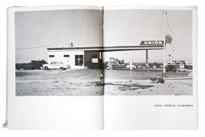
This image from Twentysix Gasoline Stations shows the postcard-like resemblance.  (from http://en.wikipedia.org/wiki/Twentysix_Gasoline_Stations)

Although, the two books are different they are also alike. Both play with one element of the book, using simplicity whether in the idea or the format to provide different audiences with their account of a journey.

Zweig’s and Drucker’s Criticisms

In this week’s past readings I have started to think more about the books we have seen and held in class. Although, their criticisms are valid in many ways their opinions are not seen in the books we have seen in Book Sets 5 & 6. In Book Set 5 we looked at Wordswordswords by Edwin Schlossberg with images created by Robert Raushenberg and Jasper Johns and in Book Set 6 we saw The WunderCabinet: the Curious Worlds of Barbara Hodgson & Claudia Cohen. These two books seem to not only refute Zweig’s and  Drucker’s critisims but also answer Drucker’s prerequisite questions about artwork.

Wordswordswords was an experience envisioned by Edwin Schlossberg. The book offers an interesting presentation – a cold, crisp metal slip box which conceals a unbound book of similar description. The actual book itself serves the reader by creating an experience – go through the pages to pull apart the story by literally changing the appearance of words through separating the many pages that hold the building blocks for the words but only appear to be random shapes.  By having the pages come together to form words, instead of just having them typed on a single page, allows the reader to feel as if their separating the pages is a form of deconstruction and investigation through the book. The project creates an inventive interplay between words and their material. The materials of the words serve as the carrier for the experience in a new way than in the traditional book.  Schlossberg’s word and page interplay forces the reader to slow their process and makes getting the meaning of the words more than just reading them.

The WunderCabinet: the Curious Worlds of Barbara Hodgson & Claudia Cohen engages the reader in a nearly overpowering way. The book itself offers a beautiful journal like collection of observations with hand-colored drawings and diagrams with the occasional 3D element. The bottom of the box offers a collection of miniature wonders ranging from various clock faces to shells. The box itself is also captivating with its inlaid wood design. The art serves to illustrate for the reader the larger aspect of the collection that would not fit in the box and also shows the illustrators view on the piece. The tactile objects allow the reader to understand the book by holding the physical inspiration for the writing. The combination of the two allows the viewer to imagine that they are holding the prized journal of a friend who is letting them touch their most prized treasures.  Having this sort of interaction with the book immediately establishes an intimate relationship with the text and objects. The materials serve to allow the reader the opportunity to look at the objects someone has honored in a new way – to people in the modern world a watch face is often over looked but seeing the book and then getting to remove the watch from its small, personal velvet compartment makes it seem like a new discovery.

Wordswordswords and The WunderCabinet are two modern Livres D’Artiste that exceed the requirements set forth in this past week’s criticisms. These two books also offer exquisite examples for what modern Livres D’Artiste should be.

A Toute Epreuve and Cortege

The term “Le Livre D’Artiste” means the book of the artist but in this case the artist is not just restricted to just the visual illustration of the book but also the text and publishing of the book. Two books that particularly stood out were  A Toute Epreuve written by Paul Eluard and illustrated by Joan Miro and Cortege written by Pierre Lecuire with collages by Andre Lanskpy.

A Toute Epreuve’s illustrations are youthfully arranged colorful shapes, some show off their wood grain while others have a flat finish. The writing in the book is minimal compared to the page area devoted to the wood blocks. Some pages neglect to have text but those with text use the illustrations as a frame. The bright shapes help to loosen the text by having it showcased in chucks rather than a steady stream of prose. This allows for the illustrations to hold and dictate the location of the text which encourages the reader to focus on the location of the text within the image. This creates a new experience for the reader instead of knowing where to focus before turning the page, the reader has to navigate their eye through the image to focus on the text location. From my observations, this seems like an important distinction in the le livre d’artistes where the art is the focus while the text is its embellishment.

20131011_111602[1]A Toute Epreuve

Cortege offers a very different and slightly segregated text with image approach compared to  A Toute Epreuve. The bright and bold collages demand to be looked at instead of incorporating the text the two part of the book fight for the attention of the reader. The text is a large full font which stretches the wide pages to the point of barely leaving a margin. The illustration creates a vibrant visual counterpart to the blocked page of text but allows for little integration or connection between the two. Although, this is a le livre d’artiste it refuses to be seen as much of a collaboration as the former book but rather parallel entities. This suggest a less successful relationship between the artist, writer and the publisher because instead of creating a solid piece the artist and writer just seem like small embellishments to one another’s work.

20131011_111303[1] Cortege

To me A Toute Epreuve is the best example from Book Set 4 of what the le livre d’artiste movement was – having text by a writer become more than written art by transforming it into a piece of visual art with the addition of an artist’s illustration all collaborated by a publisher.

20131011_111634[1]A Toute Epreuve

Book Set No. 2 & 3

The readings from the past few weeks suggest the fine printing is an almost art form where the qualities of the material used have to match the artistic excellence of the type, proportioned margins, as well as deliberate letter and line spacing. Illustrations are also encouraged. William Morris states “the picture-book is not, perhaps, absolutely necessary to man’s life, but it gives us such endless pleasure, and is so intimately connected with the other absolutely necessary art of imaginative literature that it must remain one of the very worthiest things towards the production of which reasonable men should strive,” (The Ideal Book). This quote highlights one of the differences I find most noticeable between fine printing and modern books – the difference between having a connection with the book versus reading it to understand the vision of the writer. Having a pleasurable connection suggests that you are experiencing the book based on your own interpretation rather than just understanding what was intended by the writer.

I chose to look at The Works of Geoffrey Chaucer designed and printed by William Morris (1896) from Book Set 2. This book clearly follows Morris’ ideals for fine printing by having a grand leather cover, gothic lettering, intricate illustrations complete with various borders and proportional margins. The size of the book also echoes the importance of the quote above. This is not a book which can be easily handled, but rather requires one to stretch their arm across the book just to flip the page; this makes the reader experience it in a more complex manner instead of simply passing through the pages. The handmade paper increases this experience by having a crisp sound and texture. This book is a work of art and makes it clear why Morris was against the industrialization of books.

In Book Set 3 I looked at Songs from the Decline of the West which was designed, published and printed by Walter Hamady (1977). This book although created almost a century later was obviously inspired by Morris’ ideals. The paper is handmade which creates a textural experience for the reader, the margins are proportional, and the letter and line spacing is emphasized and consistent. The book differs from Morris’ in its lack of interaction between illustration and text as well as its size. Although, the binding has been carefully crafted, the size of the book allows it to be looked as more casually and requires less interaction with the reader.

These two books although both artistic and of fine printing quality offer two different connections with the reader. The Decline of the West sets up a clear interpretation for the reader and allows us to experience it as the artist had conceptualized it. However, The Works of Geoffrey Chaucer allow the reader to delve into an artistic page so carefully designed and oriented with ornate borders, type and detailed illustrations that the reader has to create their own views of the work. Although The Decline of the West is a fine book, I prefer the aesthetic approach seen in The Works of Geoffrey Chaucer in part because it is so overwhelming in its beauty that one cannot look at a simpler book and award it with as much artistic value.

20131004_110335[1] The Works of Geoffrey Chaucer20131004_110337[1] 20131004_110433[1] The Decline of the West20131004_110451[1]

Book Set No. 1

I was fascinated by Andreas Vesalius’ De humani corporis fabrica librorum epitome made in 1565. Although, all of the books in this first set were interesting in their materials, covers, letterform and imagery this book stood out as unique in many ways.

The images of the bodies were extremely detailed, much more so than the other humans featured in books like the Liber Chronicum. Due to this detail it seems that Versalius must have observed actual bodies instead of just drawing from other’s drawings as seen in Herbarius Latinus. The detail in the illustrations suggest that they were made from engravings rather than the formerly used woodcuts. Allowing for so much detail shows how education was effected by the emerging technologies in print. The book was set up in the traditional way with a separation between bodies of text and the images. However, all the muscles and organs were labeled which created a blend between the visual letterform and art.

Before developing these technologies only a few people who were trained or worked on bodies would have known what muscles and organs looked like. This book creatively shows the detail of a body without having to learn from a lifeless illustration of a corpse.  Instead it is enriched with the lively illustrations, which make the science of the human body more accessible to people who aren’t used to seeing such typical anatomy pictures. The images show the various muscle groups on graphically posed bodies, the skin hangs off the exposed muscle like a layer of clothing. Seeing the bodies exposed in such a way is unlike any other anatomy book I have seen and offers a more abstract approach to understanding the human body.