From Marinetti to Depero

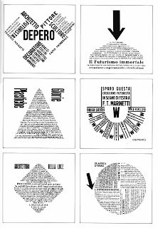
The most strikingly and identifiably futurist books in all of the book sets were Marinetti’s Les Mots en Liberte Futuriste (1919) and Depero’s Depero Futurista (1927). Despite commonalities, the books serve very different purposes. Marinetti’s work instructs the reader on the necessity for words and freedom, and its essential elements and hindrances; the words as image are meant to teach through example as well as critique European relations. Depero Futurista, though heavily reliant on words in freedom, is rooted more in the artist than the technique. Depero’s approach to words in freedom is much cleaner and geometric than Marinetti’s, arguably less politically radical. I believe that this was an intentional choice of Depero’s, one made in part to ingratiate futurism as a movement to Mussolini and encourage him to endorse it.

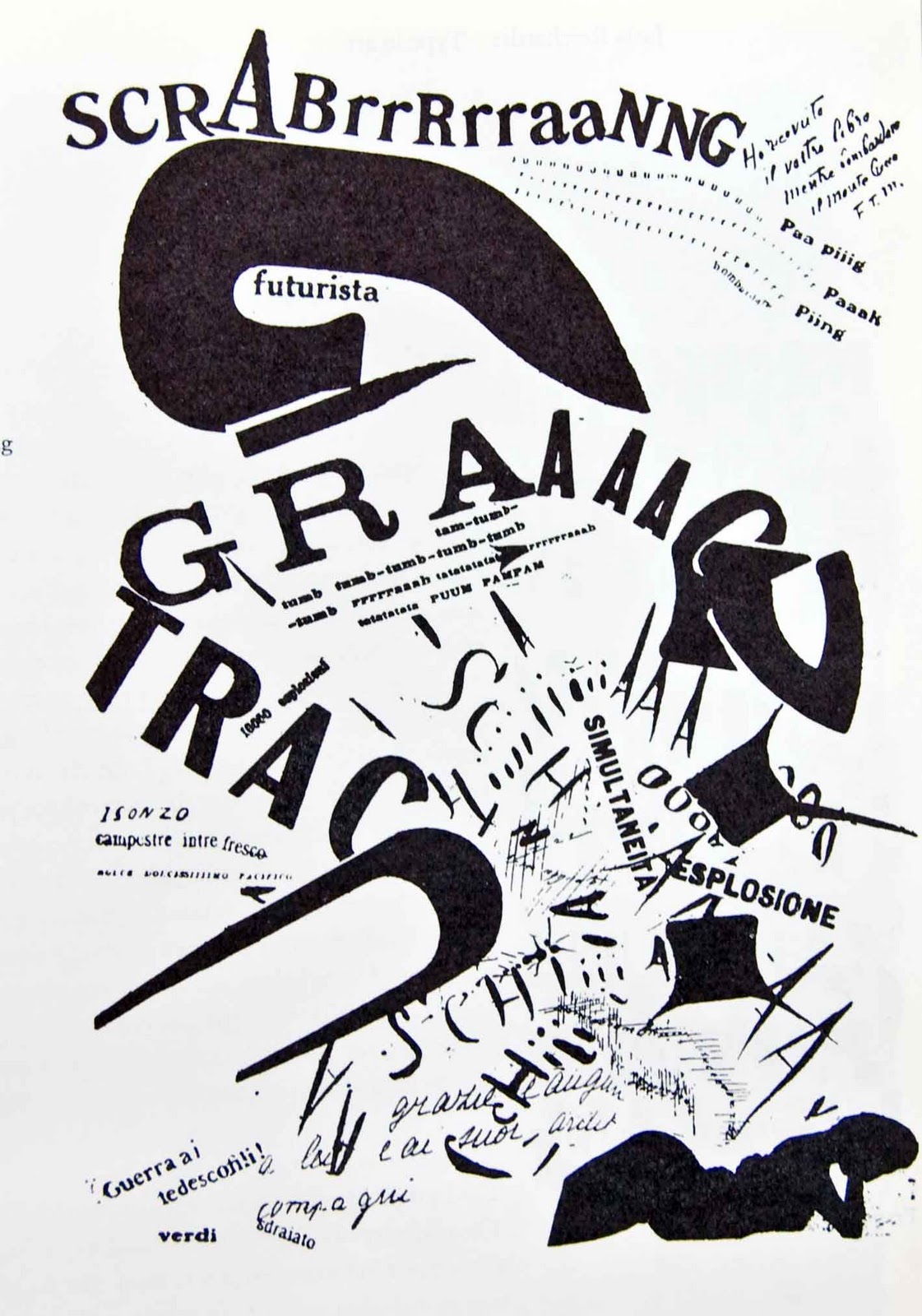
Marinetti’s Les Mots en Liberte Futuriste revealed and explained the thinking and intentions behind words in freedom, as embodied in his Zang Zang Tumb. He wanted to reduce words to their physicality, prioritizing their most primally tangible qualities; in this way, he transformed them into action. For these word-objects to be as representative of movement and action as possible, Marinetti arranged his mise en page chaotically and unpredictably. Random capitalization, sporadic bolded type, multiple types within words and sentences,  a disdain for symmetry, and a general atmosphere of disorder all contribute to Marinetti’s vision of reality. They represent the destruction of traditional conventions surrounding language, such as grammar and syntax, to act as a parallel to Marinetti’s call for the cleansing burning of the past to fertilize the future.

Depero Futurista, created almost a decade later, is the undeniable child of Les Mots en Liberte Futuriste. However, Depero’s use of words in freedom is much more ordered than Marinetti’s. His rejection of the norms of language are in line with his mentor’s, but his arrangement is not so arresting. Depero’s images are constructed to challenge the view but also to please; they are consistently symmetrical and centered in basic geometry. His text varies in size, thickness, and type but never with the same forceful spontaneity that characterizes Marinetti. This drastically changes the tone of Depero’s words in freedom into one less obviously aggressive toward tradition, toward Italian culture. Futurism loved fascism and sought Mussolini’s public approval from his rise to power, but the critique and dismissal of Italian tradition made it politically unwise for him to do so. Where futurists wanted to eliminate museums and and forget history, fascists wanted to return Italy the power and pride of the Roman Empire. As fascism gained influence and presence within Italy and Europe as a whole, futurists strove for endorsement through compromising the most offensive aspects of their art. I believe that Depero’s use of words in freedom was a clever attempt at maintaining the political implications of the words themselves without supplementing them with politically charged images. Unfortunately, diluting the futurist technique never made it palatable to Mussolini.

Drucker is Wrong/wordswordswords/Viente Poemas De Amor Y Una Cancion de Desesperada

Both Zweig and Drucker believe that all books must have some strong intellectual purpose to them, something that contemporary books seem to lack. Zweig writes that rare books are collected for their content and place in the history of ideas, but these criteria are not applied to contemporary book purchases. Instead, she says, the prettiest books are the ones that sell, regardless of the message (or lack thereof) conveyed. Drucker, with thinking very similar to Zweig, argues that “in the realms of fine art or literature elaborate mechanisms exist for sorting and filtering work,” and books as an art form suffer from this lack of academic structure.  She proposes that, as well as a firm framework for evaluating books, and established canon would bring order and clarity to a confused genre.

However, I think that Zweig’s focus is ideological, and that Drucker’s view on art and the academy are incompatible with my own.

Zweig’s method of evaluating book-worth is the desert island test; if you were stranded, what book would you bring? She claims that a paperback would bring her more enjoyment than an artist’s book because, as a rule with few exceptions, the content is more engaging. While that is a perfectly fine choice for the last book you will ever encounter, is that a fair way to judge luxury books?

In addition, why is it contradictory to think that a beautiful, meaningless, purposeless book can be art? Oscar Wilde claims in his preface to A Picture of Dorian Gray that  “those who find beautiful meanings in beautiful things are the cultivated. For these there is hope. They are the elect to whom beautiful things mean only beauty.” Is beauty not an end and purpose in and of itself? Must the meaning be plain for it to be appreciated? Wilde concludes that “all art is quite useless.” Is it a higher artistic calling that influences these critics to conflate greater intellectuality with greater art? Drucker claims that a canon or set structure of evaluation will rescue artist books from themselves. However, any ‘canon’ that emerges from “critical consensus and debate” will begin the process of

funneling people into one mode of thinking The academization of artist books will lead it down a path of invented dichotomies that will serve only to limit expression. Wilde writes that “no artist desires to prove anything” and that “it is the spectator, and not life, that art really mirrors.”  Drucker is entitled to a canon that speaks to, that mirrors her. However I cannot believe that a set canon, especially one defined by the racialized, classed, and gendered academy, could mirror even the majority of potential spectators. Who, then, benefits?

That being said, I would argue that both Schlossberg’s wordswordswords and the Gunnar/Keever/Neruda collaboration of Viente Poemas de Amor y Una Cancion de Desesperada would pass Drucker’s book-legitimacy test.

wordswordswords interested me mostly in that it required the reader to create meaning through connecting page and text. The book played out as an engaging puzzle, poems assembling and fragmenting as pages are turned, layering on one another as the light shines through the paper. Though the words themselves are arguably most manipulated material in the book, the meaning conveyed by them often undermines their primacy. Schlossberg printed that “THESE/WORDS/WILL/ FALL/ APART/ TO BE/ SURE/ TOMORROW,” a strange idea in a book comprised almost entirely of them. It is obvious in his treatment of words, especially in his repeated use of fragmentation, that this book is both a celebration of the word and a reminder of its ultimate mortality and futility. In this way, it “moves my understanding from one place to the other” as the book progresses.

Neruda’s Viente Poemas de Amor y Una Cancion de Desesperada was beautifully adapted by Gunnar and Keever into an interactive form that conveyed what, for me, is a central message of the collection. Neruda’s  20 poems inundate the reader with all of the complexity and layers of his love, almost desensitizing her to its potency. This is reflective of the redundant, unremarkable nature of a love that is not your own, and of romantic love in general; while it is necessarily unique and individualized, some form of it is experienced by the majority of humanity, making it in one sense mundane. As you approach the latter quarter of the poems, the imagery grows darker.  In Gunnar’s book, this is illustrated by steadily larger flaps, with more space as the poems progress. The brightest colors are reserved for the earliest, youngest poems, and dark blacks color the poems deeper in the book. The song of despair at the ends the book, structuring it so that as the reader plunges further into the book it becomes darker and more consuming (literally, by the growing pages). The song is given a full four pages to exist and express on, more room than any of the poems. The stanzas are layered and fractured throughout semitransparent paper, forming an obscure whole at its start. As you turn the pages to see more clearly, however, you lose sight of the whole. Despair often behaves similarly.

Drucker would appreciate it for its intellectuality, a clear merging of meaning and structure.

Cortege and Fables

Fables, as conceived by Amboise Volllard, was published in 1952 with Marc Chagall’s manic etchings paired with several of La Fontaine’s moralistic animal stories. At first glance, the relationship between La Fontaine’s text and Chagall’s images is rather standard; the traditional margins are respected, the text is Roman an serifed, printed in dark black ink and italicized. Leading was used to create the typical, centered look given to most poems. Chagall’s etchings were printed intaglio, and compose one half of the story’s folio. Vollard thoughts, however, ran much deeper. La Fontaine’s Fables, when first published, were intended for adult audiences-France at the time was morally weak, and the Fables were meant to counteract that trend. Of course, in time, the audience for the Fables grew younger until it consisted entirely of children. Vollard sought to combine, in essence, this contradiction of the history of the Fables. In his interpretation of Fables, Vollard chose the youthful contemporary artist Marc Chagall to illustrate the fabulist’s work. Chagall’s etchings for the book are sinister and foreboding, and eerily well matched to what we now consider children’s stories. For la Fountaine’s La Deux Mules, Chagall produced a frenzied etching, all in monochrome. The only colors in the book – black and white – emphasize the original moralist message of the Fables, and the dichotomous way morality in general is viewed. In the etching of the mules, the black creeps into the outline of the vain robbed and fallen mule, a physical representation of the sin he tainted himself with. The other stands erect, humble, and white.

Cortege by Pierre Lecuire is unique and rare in that its publisher was also its writer- and its artist, and its advocate. Cortege is entirely the product of Lecuire’s mind, making the text – a metacommentary by Lecuire about the book itself- rather fitting. Lecuire writes that his “book is a procession” and the text is meant as a visual pause for the parade of pochoir images. The margins for the text of Cortege are not so neat and large as those of Fables, and the images themselves extend beyond the page – there are no margins. The color used by Lecuire is vivid and dynamic, deeply bold and compellingly abstract. The text, which, especially in comparison with the images, occupies a familiar mise en page in order to balance the barrage of color of the images, creating a harmonious folio.

For both Fables and Cortege, the intended audience was a mix of art collectors and book collectors. The historically conservative book collector demographic struggled initially to accept the vitality of the images of both books, and art collectors did not typically purchase books.

Distinguishing characteristics of the livre d’artiste, instantiated in both Fables and Cortege, include the use of rare and fine materials, limited number of editions, hand coloring/printing, large formats, fine bindings, and a collaborative nature. Artist books are usually the product of a team of individuals, of many visions, making them a unique and inclusive art form.

Jazz and A Toute Epreuve are important historical landmarks of the artist book, or deluxe book. Cortege and Jazz are often linked because of their similar format and tone, especially in their shared use of pochoir printing. This style of book has influenced artists books irrevocably.All of this began with Matisse’s JazzA Toute Epreuve is similarly influential in that in compromised the traditional mise en page. The images and text loop around one another, interacting and emphasizing each other through their placement on the page and the bright, primary colors colliding with the black, Roman text. Both books changed the way in which mise en page and how images and text interact with one another are viewed by contemporary publishers.

Book Set 2 & 3

Fine printing, at its heart, is an attempt to return to Morris’ more reverential approach to book making. The belief that books must be composed of only the highest quality materials, that they are meant to be limited, and that the individual books produced are a unique pieces of art in need of preservation. Fine printing looks backward to the history of printing and its surrounding culture to produce work, both for contemporary books and historical reprints. In this way, fine printing is very closely linked to the Arts and Crafts movement, championed in part by William Morris. His press, the Kelmscott Press established in 1891, was among the first fine printing presses. The trend of fine presses as small, privately owned businesses is still integral to the fine printing identity.

The Four Gospels of the Lord Jesus Christ, from book set one, caught my attention for a number of reasons. Initially, the history of the book struck me; it is very plainly inspired by the King James bible, an edition made in an attempt to lighten the weight of the King’s sin on his shoulders. The King James bible is in itself influenced by William Morris, and the Four Gospels is no different, if much larger. In the same way that Morris included multiple embellished initials at the beginning of his passages, the Four Gospels used the capital letters in its text to further illustrate or emphasize certain aspects of the gospel .For example, the ‘T’ in a verse about the conniving of the devil had for its crossbar a snake. Smaller embellishments, like symbols akin to asterisks and flowers, were used as paragraph markers and, again, as emphasis. This is was obviously borrowed from Morris, as is the respectful, consistent treatment of the margins and use of a bright scarlet ink to capture attention. However, the focus on simplicity of the mise en page left no room for Morris’ woodcuts. It also emphasized the semiotic value of the text.

Song of the Decline of the West is similarly Morris-esque in its centered text, and the leading used between lines is consistently wide and readable. It, too, embodies fine printing in its materials. It is constructed of hand made paper, high quality paper that gives the reader a textural experience that is consistent with the grainy feel associated with the sandy West. The book, however, fails to convey a deeper link between text and image, and the elaborate woodcuts Morris loved so much are absent.

Of the two books I have discussed, I prefer the approach taken by The Four Gospels of the Lord Jesus Christ. I find it much more visually compelling because instead of being bombarded by illustrative stimuli, like so often happens when viewing Morris’ work, the reader is left to intuit the semiotic value of the text. With no distracting woodcuts to drown it out, the voice of the text becomes clearer. The quiet, undisputed authority of the Roman type used in the Gospels lends itself perfectly to the Word of God. The semiotic value of the Roman text can communicate more effectively and clearly the power of God than any drawing ever could.