New Intimacy

The Fluxus movement pushed boundaries in the hope of redefining the parameters of art. The aptly named Fluxus 1, shows the movement’s obsession with the collective and the varied contributions of multiple artists. Fluxus 1 is filled with instructions for how to engage with the work: “put finger in hole,” “put in 5 envelopes.” The result is a greater intimacy between reader and text. The author aknowledges the discomfort of this active exchange in his selection of bizarre images, such as x-rays of teeth and a photograph of the patch of skin behind an ear. The book is also comprised of various found objects which the audience is invited to contribute. In this way, the reader becomes author.
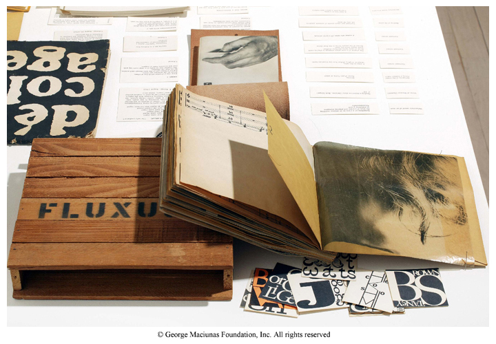
Fluxus 1 is not written or illustrated by George Maciunas, it is “compiled and published” by George Maciunas. The artist’s role has shifted from creator to coordinator. This is also apparent in the work of Sol LeWitt, such as Arcs, Circles & Grids. It is a revolutionary concept that the artist can write a set of instructions to be carried out by others.Among the feminist books from Book Set 10 were Treading the Maze: An Artist’s Book of Daze by Susan King, and The Dickenson Composites by Jen Bervin. The first focused on a woman’s struggle with breast cancer, and the second on a famous poet’s unique annotations and marks. These books approach intimacy from a different angle than in Book Set 9. Through their subject matter, they tell us that a woman’s individual experience is an important and appropriate subject for a work of art.

Book Sets 9 and 10 redefined the concept of artist and art. Art is an experience. Art is life. This new artistic realm is well explored by the Relational Aesthetics movement and by the artist Ai Weiwei. There is a fascinating documentary called “Ai Weiwei: Never Sorry” which I highly recommend. As he says: “I think my stance and my way of life is my most important art.” [youtube]http://www.youtube.com/watch?v=ma6Q03ljdrg[/youtube]

Livre D’Artiste: An Interaction Between Text and Reader

Image

Book sets five and six display the formation of a much more interactive relationship between the text and the reader.

A Tactile Experience:

From Book Set no. 5, Edwin Schlossberg’s Wordswordswords is a perfect example of the important role of the reader’s hand. This book gives the reader the responsibility of constructing the text by assembling (or dissembling) the irregular pages which are often folded or cut into strips. Some sentences are even printed on multiple, moveable pages; others have to be held up to the light and read using the shadows on the back of the page. One sections reads “These words will fall apart,” whose letters are printed on multiple pages. The reader’s interaction with the physical book engages the meaning of the text, as the turning of the pages fragments the letters into small, abstract pieces.

Some other examples of books relying on the reader’s touch can be found in Book Set no. 6. The two books of poems by Pablo Neruda: Las Piedras del Cielo, Skystones and Viente Poemas de Amor y Una Cancion Desperada contain poems printed on flaps; it is the reader’s touch which reveals their poetry. This action transforms the experience, instilling in the reader a sense of intimacy which resonates with the subject matter. As with a loved one: if one removes the facade, one will find hidden depths, beauty and meaning within.

Chen-Panorama-L2_big

A similar phenomenon occurs in Panorama: By lifting flaps and interacting with the physical object, the reader reveals deeper meaning and narrative. In this book, there is also great attention paid to guiding the reader’s gaze. Such is the case on the page with the stones. 

09e6b33b7529488d418b6cb470ccc77610e3bd375ba96ede2dc08885.jpg.1000x1000_q85

The reader’s attention is led into the shadows beneath the rocks, like Alice falling down the rabbit hole.

The WunderCabinet: The Curious Worlds of Barbara Hodgson & Claudia Cohen is quite literally a box of trinkets and treasures for the reader to discover and handle.

Handshandshands:

Published title page and letterpress. Ted Hughes. Capriccio. The Gehenna Press, 1990.Many of the books in these sets incorporate the image of the hand. Capriccio displays a beautifully rendered and visually surprising title page, where the hands of a creature wrap around the title. Like the reader’s hands, they react to the text.

There is a hand on nearly every page of Roy Fisher’s The Left-Handed Punch. There are also movable elements, held to the page by a pin, around which each segment may be manipulated by the reader. Another factor enhancing the tactile experience is the various patterns and textures of the visual elements. On one page, there is a blue x-ray of a hand, which looks as though it were made of denim. One must reach out and feel the page to be sure that it is merely and print.

Visual Projection:

The use of reflective metal in Wordswordswords places the physical image of the reader within the world of the book. This is also true for the plastic pages in Alphavitos, whose reflective surfaces change with the colors and lighting of the reader’s environment. These books engage the reader’s world, drawing the reader in, whereas, the digital book, Between Page and Screen, projects the words into a synthetic cyber-version of the reader’s world.

punch2

Overall, the Livres d’Artiste forge a much more dynamic and tactile relationship with the reader.

Relationship Between Text and Imagery

I found that, among the books we explored in this last set, there were various relationships between the text and the artwork.

In Fables, we saw a more traditional mise en page. The artwork played the role of illustration, but it was not a mere decoration: It was presented as playing a role, equally important in understanding the text, but still confined to its own quarters. An exception to this was found on the title page, where the artwork had a more dynamic and dominant presence. The name of the artist and other information were confined to the corners among the foliage as the images spread across the title page, transforming it into an inviting scene, drawing you in to discover what lay amid the pages.

Although Picasso’s work in Le Chef-d’oevre Inconnu was not integrated with the text, there was a play between the two, as evidenced by the wordless introduction comprised of lines and dots, often resembling musical instruments. On the title page (see below), we see the image of two overlapping faces. The O and E in the title do this as well. For the first time, there is a clear dialogue between the images and text, the latter of the two beginning to enter the realm of artwork, which we see come to fruition in Cortege and Jazz.

In Jazz, the literature and artwork were well balanced. The calligraphic font played off the vivid pochoirs. This made sense, as the narrative seemed to contain a similar dialogue with the images. This was also the case for Cortege, which held bold pages of text that bled to the very edge and complimented the audacious collages which were also without margins. The justified text was no longer viewed as words, but, rather, a visual field of color and shapes — an abstract block, just like the artwork.

Books, such as A Toute Epreuve, displayed the artwork as the dominant partner. The quiet font was often pushed by the lively blobs and squiggles out of the confines of the traditional margins to linger, off-centered, in the far corners of the page.

So far, we have seen little deviation from the traditional format of the codex, but a shift in and greater variety of text-artwork relationships.

Function

As Rogers wrote, “Some of these appeal to the intellect, some to the emotions, some to the eye, and some even to the sense of touch. One cannot pick up a beautiful book without inhaling this elixir of creative effort, which is at the same time so stimulating and so gratifying to the senses.” I think that Morris was speaking to a higher standard in book making which would produce books that appeal to the senses — which flaunt their quality craftsmanship. On the first day of class, we talked about why we had chosen this course. Many of us spoke of our love of old texts. We were not talking about the content, but rather the beauty of the binding and fonts used. Personally, the experience of reading a slapped-together pamphlet with yellowed pages and uneven margins is far less rich than when I read a book written with flourish on hand-made paper.

I agree with Russem’s point that a book must be true to its function to “convey the coherent and specific ideas of a writer.” (p. 51) and that it need not be handsome or embellished. I disagree that it doesn’t need to be well-made. Of course, by definition, any form of written or printed pages joined together can be considered a book. But there is value in craftsmanship. Unlike Morris, I acknowledge the value of a paperback novel in serving its purpose, if not with as much flourish. But that third chair is not a folding bridge chair, it is one which eventually bows or collapses under you. A book which is not made well may serve its purpose to a certain extent, but it will cheapen the reader’s experience, allowing only the formation of a weaker relationship to the words. In class, we learned about semiotics. Meaning and intent may be conveyed, not only by the lettering, but also by a book’s binding, the arrangement of the pages, the spacing of line and character, its coloring and illustrations.

I believe there is a middle-ground between Russem and Morris’s ideals. Morris regards the art of book making as a craft which should abide by certain rules for aesthetics, most of which deal with legibility, aiding in its function as a means of communication. Morris is very concerned with legibility and goes in-depth about spacing of both character and line.

As for Russem’s example of the chair which is so handsomely crafted that it is emotionally painful to sit on, at that point, doesn’t the it become a work of art, rather than a utilitarian object? What do you guys think?

I agree with evmdavis that Morris’s villainization of industrially produced books is somewhat close-minded. I believe there to be potential within the industrial world to produce quality books. Although, I have yet to find a mass-produced book which surpasses the beauty and quality of the hand-made manuscripts I have seen.

Covers, Translation and Illustration

“Don’t judge a book by its cover.” I did not take this advice. I found I was drawn to books with elaborately decorative bindings or those which were delicate and simple, their cleanliness evoking a sort of mystery which drew me in to explore what delightful illustrations could be held within.

My favorite experience was looking through the Nuremberg Chronicle. I enjoyed looking at the illustrations and finding where blocks may have been re-used.

It was thrilling to be able to understand what was being described due to the availability of a faithful translation. Knowledge of their meaning brought life to the illustrations which before had been bizarre and perplexing. But reading the translation was not enough — I wanted the real thing. I was able to find matching pages and read through them line-by-line. I wish we had translations for all of the different texts.

Book Set 1

I don’t know about you all, but I felt the need for a visual supplement to the readings to truly understand the process of early printing. These two videos were quite enlightening.

The first is a video of the press, the second is of casting the metal type.

[youtube]http://www.youtube.com/watch?v=ksLaBnZVRnM[/youtube]

[youtube]http://www.youtube.com/watch?v=u–84uPhNSU[/youtube]

(there is a little bid of an audio overlap in the second video, but it is only for a few seconds)

The throw when the metal is poured into the mould made me nervous. It doesn’t look like the man in figure 8.1 from the reading was wearing a glove. Not only was it a challenging job, it was dangerous as well!