Blog Post 5 – Futurists and Fluxus

Looking back in our class, I think Les mots en liberté futuristes (1919) and Fluxus 1 (1964/65) represent many of the changes that occur through the 1900s in the book world. Les mots focuses more on typographical changes, and has some innovations in page design and reader interaction, while Fluxus takes full advantage of page design and the outside world.

Les mots, featuring text and graphics by F.T. Marinetti, takes advantage of cheap material and binding in order to reach a larger audience. It begins innocently enough, like any other mass-market book. Gradually, however, its design changes – font types shift throughout the text, and it grows larger and smaller. Eventually, words jut and slide around the page, until the text launches into Futurist poetry that stretches beyond the normal boundaries of a page. The typographic arrangement and the use of onomatopoeia create a cacophony made to awaken the common people and break the status quo in order to begin anew.

Ultimately, however, what has endured and influenced future works is the innovative typography. It has influenced much of popular culture after World War I, such as in advertising, and many artists and art movements, such as Pop Art and Bauhaus, seem to have taken inspiration from the unique design of text. George Macinaus, the ringleader of the Fluxus movement, is one of these artists (though he may not have been directly inspired by Futurism). His typography unites the diverse works that Macinaus compiled and published in Fluxus 1 (1964/65), which is a cacophony of a different sort, and further innovates the structural ideas found in Les mots.

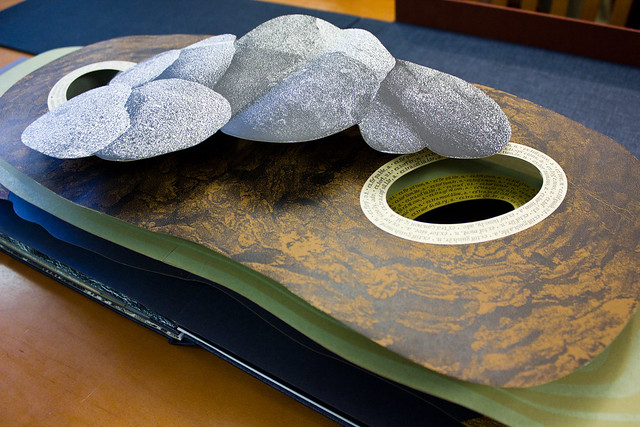
Where Les mots expanded the page by having the reader unfold them, Fluxus works to make the outside world a part of its story. The reader is invited to pack and unpack the numerous envelops in the book, pulling out different objects that represent exhibits and performances by Fluxus artists (who all worked in different ideological schools and movements). One envelope has a paper airplane, while another has some messy napkins.

But what really draws in the outside world comes near the end, with a musical opus of silence. The pianist is asked to sit at the piano, “play” each piece with the page and not from memory, and to turn the pages. The trick here is that the musical piece isn’t about the melodies – it’s about the sounds outside of the music. It’s about the ambient noise that we don’t always pay attention to. In this playful way, Fluxus 1 incorporates the reader and the space outside of the book beyond just turning the page.

Futurism and Fluxus are similar in some regards – they both share a mistrust of the concept of “high art,” and focus on changing everyday reality into something else. Futurism wanted a complete societal change by destroying the institutions around them and embracing the future, and distorted ordinary words into something unrecognizable at the time. Fluxus, on the other hand, didn’t have such grand aspirations; it’s more comparable to Dada, but with a much more tongue-in-cheek, almost innocent nihilism. Rather than destroying reality, Fluxus just brings it on the level of art.

So yeah, I think they’re pretty cool books!

Photography in the Book Form: Ed Ruscha

Ed Ruscha’s Twentysix Gasoline Stations (1962) was not about making beautiful photographs. It’s a square, thin, paperback book with 26 black-and-white photographs of gas stations along Route 66 during car rides between L.A. and his hometown, Oklahoma City. Similarly, in Every Building on the Sunset Strip (1966), it’s a flat accordian pamphlet with a 25-foot-long Birdseye viewpoint of the two-mile strip. So, how did Ruscha’s books influence art and photography over the last fifty years? Why is he one of the central figures in photography from the late 20th century? How does his work successfully engage with the book form? These are questions I would like to explore further.

03-ruscha-mock-up-for-every-building-sunset-strip-1966_custom-7b11775b1eed7fd8c0dbc5fb32859b8f55477d17-s40-c85Every Building on the Sunset Strip (1966)

Rusha’s photographs fell somewhere in between the spectrum of early California Pop Art and Conceptual art. They weren’t about emotional engagement. They were simply photographs of  “everyday subject matter presented in an uninflexed, repetitive manner” (Walker, 2012). The photography, layout, and typography all make a book like Twentysix Gasoline Stations a meaningful contribution to artist’s books of the twentieth century (Walker 2012). In the case of Twentysix, the size of the book is small in itself, as most of Rusha’s books were. The text is industrial looking, and the layout very simplistic with photographs and very little text, if at all. Twentysix’s very “Huh?” quality is what makes it engaging. We become intrigued by the book’s mundane, inconsequential quality. Yet, it appears that the artist, Ruscha, saw something in the landscape, the design, and the painting-like quality of the image, to capture it. In this YouTube video, Ruscha, he says how the white man now owned these gas stations that were previously Native Americans’ land. The images that he documented were his own “cultural curiousities”. (TateShots, 2013). Ruscha did not take pictures just for the sake of taking them. The subjects of his photographs were reality, visible or hidden. These photographs are emblematic of the period, but are also archival, reminants of the past that we can look to today, and there are many contemporary books influenced by them (See: Twentysix Abandoned Gasoline Stations, Twentynine Palms). 

Ruscha’s “anti-art” aesthetic and realism were and continue to be influential in the field of photography. His understated covers, simple typography, and seemingly ordinary subject matter were a new method of making books and making art. The books of Ed Ruscha are “Neither an art book…nor a book on art” but “a work on [their own]” and a “fragile vehicle for a weighty load of hopes and ideals” (Klima, 1998).

2004.466_ruscha_imageprimacy_v1_740Twentysix Gasoline Stations (1962)

2004.461_ruscha_imageprimacy_740Twentysix Gasoline Stations (1962)

[youtube]http://youtu.be/0xboX5cvIzw[/youtube]

Photographs from http://whitney.org/Collection/EdwardRuscha

If I were stranded on a desert island I would be in good company if I had brought with me Babara Luck’s Night Street and Pablo Neruda’s Las Piedras del Cielo.  I believe that both books have the depth to engage and entertain for a prolonged period of time. To me neither opened and ended with the rushed turning of the pages, but instead revealed greater layers for examination. While Zweig’s description of the power of the novel resonates with me, I think that both Night Street and Las Piedras del Cielo  have the ability to compel the viewer beyond the fleeting impact of a brief encounter with stunning pages that Zweig claims many artist books are limited to.

I was incredibly impressed with Night Street’s construction, colors, and design. Vliet designed the book so that the experience of viewing the book could be changeable through the flexibility of the structure. Night Street is clearly more than the flipping of beautiful pages. While the book may be viewed in a traditional codex form, the structure designed by Vliet enables the book to stand up and fan out or wrap around itself. The illustrations by Johnson are beautiful, eye-catching and edgy, enhanced by the cut out shape of each page that follow the corners of tall buildings. There is such detail to each page that it would not be impossible to spend hours taking in each illustration. The way that the book is able to stand up and fan out emphasizes the message of the book as you view the pages through one another at a diagonal that follows the view of buildings down a street. In the way that a city can draw you in again and again, I believe that a viewer may continually visit and explore Night Street. If I were on a desert island, a walk through the replicated urban landscape would be an incredibly valuable experience.

Neruda’s Las Piedras del Cielo had a similar flexibility and mutability of engagement. The prints of each page are beautiful on their own, but when limited to themselves Zweig might classify them as the stunning book that ended with the final page turn. The interlaying of Neruda’s poems within the prints adds depth to both the physical form of each page and to the meaning of the book overall. The lifting of flaps to reveal poetic verse literally places meaning within each print that is revealed through the tactile engagement of the viewer. Beyond juxtaposition, the poems and prints relate to one another through their imagery, as Neruda’s poem “Topaz” sat on a page of yellows and oranges that represented the gemstone. Moving through Las Piedras del Cielo requires the viewer to reveal the words of each page through their movement and exploration of each page, and in effect demonstrates how meaning is dependent on the viewer. Zweig could flip quickly through the stunning pages of Neruda’s book and end her experience with the closing of the codex, but much of the work would be lost in her superficial haste. Both Las Piedras del Cielo and Night Street enable the viewer to shape their encounter with the book and activate and enhance the meaning of the book on their own terms. Within both books I saw the potential for prolonged engagement.

The WunderCabinet and an argument for beautiful vacancy

I have my personal gripes about Janet Zweig’s and Johanna Drucker’s purse-lipped critiques of the artist’s book. Their approaches have many unfortunate things in common beyond sheer contrariness (both authors, for example, approach the entirely subjective world of artist books with the single-mindedness of a scalpel). But for the purposes of simplicity and at the expense of several genuinely important and well-made points from both sides, I am simplifying their complaints into a single issue: the argument between style and substance.

Not a balanced argument by any means. Style is considered the flourishy and meaningless fodder for the masses, while substance is the meat of the matter — the stuff we’re really looking for… Consider Zweig’s condemnation of “crafty overproduced luxury items” in favor of “rich temporal experiments, books that do participate in the conversations and challenges of contemporary art”. Now read from Drucker: “Overproduction is particularly deceptive since it tends to confer importance simply through conspicuous display.” For both authors, style is the shallow, preening younger brother; an early indication of staleness, derivativeness, and meaninglessness. Not a work worth liking, in other words.

With this in mind, I will discuss The WunderCabinet: the Curious Worlds of Barbara Hodgson & Claudia Cohen. 

Wundercabinet 3


Here it is. A beautifully designed wooden box cover, containing a miniature facsimile of an antiquarian wunder-cabinet — a place in which to display your fanciful collection of foreign, exotic trinkets from around the world. Somewhere, Zweig is turning restlessly in her bed and muttering ‘crafty overproduced luxury items’ under her breath.

It also contains a journal, written and illustrated by the two artist-authors and built to resemble an old travel-journal. The writing discusses natural history, archaeology, astronomy, mathematical principles, and historically important wunder-cabinets (such as that of Manfredo Settala, a Milanese wood-turner with a collection on the sciences). However, if we’re being honest with ourselves, that isn’t what draws our eye when we open the book.

Wundercabinet


I’ll admit it, I stared at the star charts, stratigraphy plots, pressed plants, hand-inked heiroglyphs, alphabet grids, and sketches of ammonite shells first. They’re beautiful, they obviously took an incredibly long time to make, and substantively they are utterly meaningless. Unless you consider a rangy and breezy education on the contents of wunder-cabinets to be a participation in ‘the conversations and challenges of contemporary art’, of course. It would take some stretch of the imagination.

Wundercabinet 2


Here arises the difficulty with the ‘style vs. substance’ dichotomy. According to Zweig, an artist book such as the WunderCabinet is an object to be marveled at and then put aside. There is no deeper, richer meaning to it, nothing to return to but the same pictures and pressed plants. It is beautifully vacant of meaning, it is a dressed-up corpse — it would not be very useful on a desert island, in other words. (Neither would a novel, really, unless it tells you how to build a raft.)

But I can tell you personally that there is no other book I would rather return to. In fact, out of every artist’s book displayed in this class, the WunderCabinet is the only one I have requested to see extracurricularly; I have read it from cover to cover; if you were to give me one of the books from the Smith Collection for free, then you would be crazy, but I’d know exactly the one I’d want. It was inspiring. I took notes.

Zweig compared the experience of reading a good artist’s book to watching a good movie or excellent theatre, and I believe this is revealing. Cinema’s critical darlings may fit her criteria, but what about movies like The Avengers or Shrek? They aspire to no ideal, no high-browed message, no contemporary issue of importance. They aim to entertain only, and they have left their big-budget, cerebrally vacant fingerprints smeared upon the face of American culture while doing so. I would watch these movies again and again, but the sole difference between them and the intellectually underwhelming artist books Zweig so despises is a slightly heftier price tag.

This is a gross oversimplification of the issue, of course, yet the merits of the beautifully vacant book should still be discussed. Aesthetic beauty can inspire… Zweig compares the artist book to a narrative-driven novel, which is valid; but the artist book lies upon the bridge between the novel and the work of art, and its connection to the latter has been largely, and unfairly, ignored.


Putting meaning into Contemporary Livre d’Artiste

I’ve decided to contrast two books, The WunderCabinet and Wordswordswords to demonstrate how they either align or go against Zweig and Drucker’s criteria.

I think The WunderCabinet: The Curious Worlds of Barbara Hodgson and Claudia Cohen (Heavenly Monkey Editions, 2011) would fit Drucker’s criteria as a “creative use of the book format.” The WunderCabinet is Hodgson and Cohen’s idea of what 16th-to-18th century wonder cabinet collection of natural and manmade objects. It stretches beyond the pages of a more “conventional” Livre d’Artiste, and is presented instead as an inlaid wooden box. Inside each compartment is a unique and delicate object, such as a shark’s tooth, fossilized coral and glass eyeball. It’s divided into two parts, Naturalia and Artificialia and engages the viewer in a very different way, causing them to carefully and curiously examine each artifact that was handpicked or hand drawn.

IMG_3785

Zweig’s critique asks us to acknowledge whether the book “present[s] a new way of thinking”. Because of its one-of-a-kind detail, extraordinary bookbinding, and concept as a modern Renaissance wonder cabinet, I think it pushes our curiosities as an artist’s book. It embraces nostalgia and a sense of the old world in a new, tangible way. For those who happen to have access to the thirty copies in the series, the tactile quality to the book allows you to directly interact with the materials, unlike a typical experience in a museum. However, my one critique would be that the fragileness and limited accessibility does create a barrier to this particular artist’s book, which isn’t uncommon among Livre d’Artiste books.

IMG_3781 IMG_3778

For many in the course, Wordswordswords by Edwin Schlossberg (Universal Limited Art Edition, 1068) seems to be a favorite from Book sets 5 & 6. Yet, personally, I wouldn’t bring it with me on a desert island, and I don’t think Zweig would either. I can appreciate the role that the physical materials have, and the immediate tangible experience that unfolds, but to me, it lacks the curiosity and unique experience that The WunderCabinet gives viewers. I think the tangibility and interaction between book and viewer gave more meaning for me with Hodgson and Cohen’s work than it did for turning the pages of Edwin Schlossberg’s Wordswordswords. Yet, I think Drucker would find its structure and materials intriguing. It’s true – I will give it credit for bringing diversity in material, and it looks interesting.

7638340_1_l

Personally, I find that Wordswordswords has a more “art” feel than it does as a book. While the WunderCabinet certainly doesn’t have a deep underlying message of political and social change, it does teach us something about scientific reasoning and neo-Renaissance ideas in a physical, engaging way.

Livre D’Artiste: An Interaction Between Text and Reader

Image

Book sets five and six display the formation of a much more interactive relationship between the text and the reader.

A Tactile Experience:

From Book Set no. 5, Edwin Schlossberg’s Wordswordswords is a perfect example of the important role of the reader’s hand. This book gives the reader the responsibility of constructing the text by assembling (or dissembling) the irregular pages which are often folded or cut into strips. Some sentences are even printed on multiple, moveable pages; others have to be held up to the light and read using the shadows on the back of the page. One sections reads “These words will fall apart,” whose letters are printed on multiple pages. The reader’s interaction with the physical book engages the meaning of the text, as the turning of the pages fragments the letters into small, abstract pieces.

Some other examples of books relying on the reader’s touch can be found in Book Set no. 6. The two books of poems by Pablo Neruda: Las Piedras del Cielo, Skystones and Viente Poemas de Amor y Una Cancion Desperada contain poems printed on flaps; it is the reader’s touch which reveals their poetry. This action transforms the experience, instilling in the reader a sense of intimacy which resonates with the subject matter. As with a loved one: if one removes the facade, one will find hidden depths, beauty and meaning within.

Chen-Panorama-L2_big

A similar phenomenon occurs in Panorama: By lifting flaps and interacting with the physical object, the reader reveals deeper meaning and narrative. In this book, there is also great attention paid to guiding the reader’s gaze. Such is the case on the page with the stones. 

09e6b33b7529488d418b6cb470ccc77610e3bd375ba96ede2dc08885.jpg.1000x1000_q85

The reader’s attention is led into the shadows beneath the rocks, like Alice falling down the rabbit hole.

The WunderCabinet: The Curious Worlds of Barbara Hodgson & Claudia Cohen is quite literally a box of trinkets and treasures for the reader to discover and handle.

Handshandshands:

Published title page and letterpress. Ted Hughes. Capriccio. The Gehenna Press, 1990.Many of the books in these sets incorporate the image of the hand. Capriccio displays a beautifully rendered and visually surprising title page, where the hands of a creature wrap around the title. Like the reader’s hands, they react to the text.

There is a hand on nearly every page of Roy Fisher’s The Left-Handed Punch. There are also movable elements, held to the page by a pin, around which each segment may be manipulated by the reader. Another factor enhancing the tactile experience is the various patterns and textures of the visual elements. On one page, there is a blue x-ray of a hand, which looks as though it were made of denim. One must reach out and feel the page to be sure that it is merely and print.

Visual Projection:

The use of reflective metal in Wordswordswords places the physical image of the reader within the world of the book. This is also true for the plastic pages in Alphavitos, whose reflective surfaces change with the colors and lighting of the reader’s environment. These books engage the reader’s world, drawing the reader in, whereas, the digital book, Between Page and Screen, projects the words into a synthetic cyber-version of the reader’s world.

punch2

Overall, the Livres d’Artiste forge a much more dynamic and tactile relationship with the reader.

Book Sets 5&6: Wordswordswords and Panorama

Critics such as Drucker and Zweig make important and valid points about Artist’s Book’s place in the art world, highlighting the difficulty of creating a concrete criteria for the genre. The main cause for their concern is that “the junk…that is being produced under the rubric of AB’s will just drag the level of production and conception to an impossible low. In examining Book Sets 5 & 6, I find a diverse and interesting assortment of books that each present an interesting concept to the table.  I would like to discuss Wordswordswords by Edwin Schlossberg, Robert Raushenberg and Jasper Johns, and Panorama by Julie Chen as ideal representatives of what artist’s books and do and be.

Wordswordswords sets out to explore the different ways in which we think about and interact with language. The artists utilize a variety of mediums in order to share this concept with the reader, allowing him or her to experience forms and structures of language. For example, the book contains pages made of transparent film and metal-like sheets. The book also applies different fonts, font sizes, and text formats to address the different ways the reader interacts with his or her text; each new page is a playful, new experiment with language. I had the opportunity to delve into a page that used three different sheets of transparent film, each with lines of text that (when all the pages were stacked together) formed a cohesive narrative. This structure let me experience a variety of different text since I could form a number of phrases/poems with different sheets; each one creating different meaning and aesthetic every time. The font size was small so I was forced to carefully examine the text and have an intimate interaction with the words. At the same time, the intimacy was brought into contrast with the transparency of the sheet which innately brought my environment into view as the background to my text.

What I like about Livres D’Artiste books is that they oftentimes take pre-established works or texts such as poems, or in the case of Chen’s Panorama, environmental awareness content and reintroduces, expand the way I interact with them—the familiar becomes new, again. Panorama serves as a book about Life, the World, and Human existence through engaging structures. I found that the texture and layers of the book enticed me to engage in the reading panels. For example, there were several pages with different panels that provided eerie message. I could also form different messages with different panels.  What most attracted me to this book was the large, pop-up “towers” which seemed to erupt out of the page. Each layer of the “tower” had different content or continuous script throughout and I had to investigate, literally, into the page in order to understand what message Chen was trying to convey. This book brought text and the book format into a profound and lively new light.

Book sets 5&6 show many different examples of books which exist in the livre d’artiste genre. Having moved onward from the older European livre d’artiste books from book set 4, we were able to explore a wide range of what currently is being done with the genre. In our readings we encountered two important criticisms of artists books one of which was by Janet Zweig. The consideration of her critique of artists books in “All Dressed Up With No Place to Go: The Failure of Artists’ Books” factored largely in my viewing of these two book sets.

One book that stood out to me was  Walasse Ting’s 1 Cent Life, which proves itself to be an excellent book when viewed through both of these critical lenses. For it to appease Zweig’s criticism we must ask “does it [the book] contribute anything to the knowledge of the reader, does it present a new way of thinking?”  I would argue yes, it does. First we can considered it as a book of Pop Art, pop art was largely a form of social commentary, a reflective exercise in considering consumer culture during the 1940s and 50s. A number of pop artists contributed prints to Ting’s poetry which, in and of itself did great work as form of social critique. A specific example of a page that stood out to me was p12 which showed a depiction of lynching alongside Ting’s poetry. For me, this experience was striking. So rarely up until this point had I seen any works attempt to address the issue of race. It was a powerful experience having both a visually striking book and a book which confronted people with important political issues. By all means, it certainly passes Zweig’s test.

ting-1-cent-4


Another book Wordswordswords by Edwin Schlossberg, was also in the set. And while, it did not move me in the same way as Ting’s 1 Cent Life, I do believe it to still be of value. Zweig hints at the existence of such a book in her article lamenting, “Purchased for 4,500, it consists of a single word, the word “words” printed over and over on many pages (…) If you‘ve got a thing idea, it may be best to let form and content unite by producing a humble thin thing” But, how does she know it was a thin idea in the first place?

EdwinSchlossberg_1968_WordsWordsWords

Zweig’s frustrations with the genre are not entirely unfounded. It is not wrong to ask art to elicit some sort of reaction from the viewer. However, we have to question our system of valuing those reactions. So that books with socio-political impact are included and valued but also, that books which exist in the tradition of art for art’s sake may also have a place. Both Scholssberg’s and Ting’s books resonated with me but, for completely separate reasons. If we forced all books to exist as socio-political commentary then we might run the risk of limiting ourselves. Zweig begins her article with the question of whether she would bring a novel or an artists’ book with her on a deserted island. But, I would challenge this question with another question: “What novel?” Just as some novels are crafted to address matters and some are merely exercises in writing. Does not the same standard hold true for artists books? Some may be just for viewing and move us by the simple fact that they are beautiful while others, can use beauty to confront us with other important ideas.


Zweig’s and Drucker’s Criticisms

In this week’s past readings I have started to think more about the books we have seen and held in class. Although, their criticisms are valid in many ways their opinions are not seen in the books we have seen in Book Sets 5 & 6. In Book Set 5 we looked at Wordswordswords by Edwin Schlossberg with images created by Robert Raushenberg and Jasper Johns and in Book Set 6 we saw The WunderCabinet: the Curious Worlds of Barbara Hodgson & Claudia Cohen. These two books seem to not only refute Zweig’s and  Drucker’s critisims but also answer Drucker’s prerequisite questions about artwork.

Wordswordswords was an experience envisioned by Edwin Schlossberg. The book offers an interesting presentation – a cold, crisp metal slip box which conceals a unbound book of similar description. The actual book itself serves the reader by creating an experience – go through the pages to pull apart the story by literally changing the appearance of words through separating the many pages that hold the building blocks for the words but only appear to be random shapes.  By having the pages come together to form words, instead of just having them typed on a single page, allows the reader to feel as if their separating the pages is a form of deconstruction and investigation through the book. The project creates an inventive interplay between words and their material. The materials of the words serve as the carrier for the experience in a new way than in the traditional book.  Schlossberg’s word and page interplay forces the reader to slow their process and makes getting the meaning of the words more than just reading them.

The WunderCabinet: the Curious Worlds of Barbara Hodgson & Claudia Cohen engages the reader in a nearly overpowering way. The book itself offers a beautiful journal like collection of observations with hand-colored drawings and diagrams with the occasional 3D element. The bottom of the box offers a collection of miniature wonders ranging from various clock faces to shells. The box itself is also captivating with its inlaid wood design. The art serves to illustrate for the reader the larger aspect of the collection that would not fit in the box and also shows the illustrators view on the piece. The tactile objects allow the reader to understand the book by holding the physical inspiration for the writing. The combination of the two allows the viewer to imagine that they are holding the prized journal of a friend who is letting them touch their most prized treasures.  Having this sort of interaction with the book immediately establishes an intimate relationship with the text and objects. The materials serve to allow the reader the opportunity to look at the objects someone has honored in a new way – to people in the modern world a watch face is often over looked but seeing the book and then getting to remove the watch from its small, personal velvet compartment makes it seem like a new discovery.

Wordswordswords and The WunderCabinet are two modern Livres D’Artiste that exceed the requirements set forth in this past week’s criticisms. These two books also offer exquisite examples for what modern Livres D’Artiste should be.

Book sets 5 and 6

IMG_6379 IMG_6371 IMG_6375Barbara Hodgson and &Claudia Cohen The Wundercabinet book/artifact collection made for an intricately tactile reading experience.  Inspired by the 16th century Wunderkammen of European collectors, Hodgson and Cohen set out to create a project that would act as an extension of a room where such a collection of “exotic curiosities” would have been housed.  The authors successfully managed to simulate the actual experience of sensory-overload upon entering a Wundrkammen.  In an actual Wunderkammen, the collection’s owner would have been able to explain objects and provide anecdotes as needed.  Hodgson and Cohen created their book as a stand in, allowing readers a guide to their experience with the objects inside the box. While their introduction even states: “Drawn as well to a universe compressed into the side of a box, we delight in the microcosm that encourages playful juxtaposition and multi-sensory contemplation,” this is obvious withoutany explanation. The personal nature of the collection would not be as strong if the small objects were absent from the final product – even though it could be argued that the objects are not book-like. In essence, the book becomes the Wunderkammen, organizing the chaotic nature of an actual room of wonder – condensing it into a manageable form that is still complex and consuming.


Wordswordswords by Edwin Schlossberg is a book that is very dependent on its materiality for meaning. While each page is a uniform size, Schlossberg (or maybe the publisher/others involved) expanded the possibilities of experience with the use of paper, plastic and aluminum (or something like aluminum).  Each page reacts differently to its surroundings, making for a reading experience that is in constant flux. This book is aesthetically beautiful but the material choices were made to enhance the meaning of the words onthe pages. In some, the reader’s face is mirrored back at them, while in others a constant shift of light occurs as the page is turned. Using clear plastic instead of paper for some of the pages was an interesting choice that added a new dimension to Wordswordswords.  The plastic pages allowed me to see through them to the pages before/after and in other instances a stack of plastic pages worked together to form complete words and sentences – with parts of each being printed on different layers. This book would not have been as successful had it been printed with normal materials and all harmony between text and page would have been lost.IMG_6401IMG_6397IMG_6390